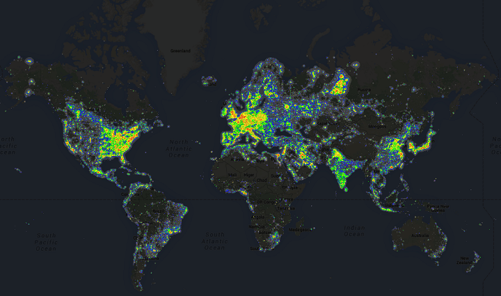
Moreover, wealthy areas tend to have more than poorer ones, which can be clearly seen in some of the more detailed maps below.
The maps are updated versions of the original The World Atlas of the Artificial Night Sky Brightness.
These maps are intended to show the levels of pollution in the atmosphere rather than the stellar visibility […]. The assumption of sea level and standard clear atmospherical conditions allows to compare pollution of different areas, to recognize more polluting sources or darker areas (areas with less light in the atmosphere and not areas where you see better the stars) without be confused by the altitude effects.
Here are some of the more interesting regions around the world. Alternatively, you can also play around with the interactive Google Maps version here.

Map shows how little light pollution there is North Korea compared to neighbouring South Korea, Japan, China and even Russia. The one below shows how this looks compared to the rest of Asia:
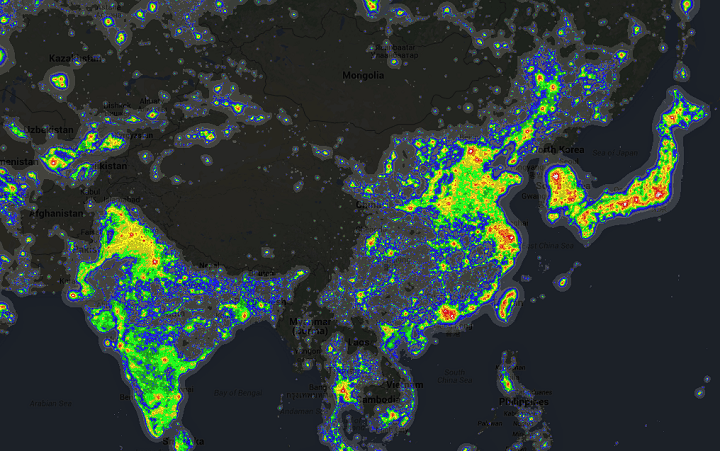
Map shows the Asian light pollution. Perhaps most interesting is China, which has a huge amount of light (and air) pollution along its East Coast, while Central and Western China are almost empty.
Japan and South Korea are also notable for their extreme levels of light pollution, which won’t surprise anyone who’s been to Tokyo. On the other end of spectrum, look at Mongolia which is almost empty outside its capital Ulan Bator.
Finally, while India is clearly visible, the amount of light pollution is somewhat less than what might be expected considering it’s the world’s second most populous country.

North America, like China, has a high population density on its East Coast. Also notable is how little of Canada has light pollution, the one big exception being the tar sands of Alberta.

Unsurprisingly, Europe’s wealth and high population density result in a lot of light pollution. Notable exceptions are Iceland, which is all but empty in the centre and Russia which is far less densely populated than Western Europe. That said Moscow is clearly visible on the map as is the activity around the West Siberian petroleum basin (to the east of Moscow).

Population density along the Nile is clearly visible in the map above. Also noteworthy is the high degree of light pollution in Israel and Palestine. Oil and gas activity around the rest of the Middle East is also visible.

However, if you travel south from Egypt you’d find most of Sub-Saharan Africa free from most light pollution. The two glaring exceptions, outside of major population centres, are the oil activity in the Niger Delta and the copper mining in Palabora, South Africa.
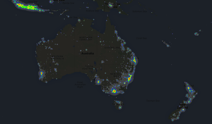
Finally, the map of Australia clearly shows that most people live in cities on the coast and the interior is virtually deserted. Contrast that to the island of Java (top left) which has a population of 143 million compared to Australia’s 24 million.
You can also check out a similar map of air pollution here.
Finally here’s a more up-to-date map from databandarr showing Asia in 2014 vs 2024:

From the author:
The night sky tells an incredible story of progress!
These satellite images capture Asia’s remarkable development between 2014 and 2024. From the dazzling expansion across China’s eastern seaboard to India’s exploding Gangetic plains, every region shows breathtaking growth.
Notice how Thailand and Vietnam’s urban centers have expanded, and how new light clusters have emerged across Central Asia. Each glowing pixel represents millions of lives being transformed – new cities rising, infrastructure connecting remote areas, and economic opportunities spreading across the continent.
The most striking change? The sheer intensity and spread of illumination in 2024 compared to a decade ago.
🛰️ Data: Earth Observation Group — VIIRS Nighttime Lights Annual v2.2
To learn more about light pollution and population density have a look at the following books:
- The Darkness Manifesto: On Light Pollution, Night Ecology, and the Ancient Rhythms that Sustain Life
- Fighting Light Pollution
- Saving the Night: How Light Pollution Is Harming Life on Earth
Notice anything else interesting in these maps? Share it in the comments section below:


Dave says
look at north-west europe. wow!
Robert Crooks says
You mentioned the “tar sands of Alberta”. Please point those out on the map. Because I’m in Alberta and I don’t see anything substantial lit up north of Edmonton. The bright lights you see are Calgary and Edmonton, the 4th and 5th biggest cities in Canada. Sprawling and bright, but not at all related to bitumen production. If you look really hard you can see Ft. MacMurray where the oil sands are. I can understand being biased by politicized environmentalism (you called them “tar sands” which is more like what you have in the middle of LA at La Brea, not what you have in Athabaska—it’s different stuff) but I’m disappointed by the failure of geographic acumen on a page about MAPS.