Brilliant Maps

Making Sense Of The World, One Map At A Time

  • BOOK!
  • Newsletter
  • Board Games
  • Posters
  • Scratch Maps

Mesmerizing Map Of Global Aerosol Pollution

Last Updated: December 12, 2023 Leave a Comment

Click To Get My 10 Best Brilliant Maps For Free:

The video above comes from NASA’s Global Modeling and Assimilation Office and shows global aerosol pollution and other particles. And just to be clear, this is aerosol in the scientific sense:

A colloid of fine solid particles or liquid droplets, in air or another gas.[1] Aerosols can be natural or not. Examples of natural aerosols are fog, forest exudates and geyser steam. Examples of artificial aerosols are haze, dust, particulate air pollutants and smoke.

So this isn’t all due to people using aerosol deodorants and paint cans! Also it’s not all pollution, a lot of what the map shows are actually natural processes.

In the video above: dust is shown in red, sea salt is shown in blue, black and organic carbon is shown in green and sulphate is shown in white. The period shown is from August 2006 through April 2007.

It would be interesting to see how the growth of China and other countries has further altered these patterns in the last decade.

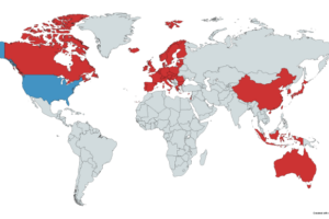
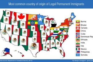
Here are just a few of the more interesting images:

Europe Africa Pollution

Europe and Africa

North America Pollution

North America

Antarctica Pollution

Antarctica

Australia Pollution

Australia

Asia Pollution

Asia

Want to learn more the issue? Then read:

  • Climate Change: What the Science Tells Us
  • You Are Here Around the World in 92 Minutes
  • Air Pollution and Global Warming: History, Science, and Solutions

Also see: 7 Best Filtrete Smart Furnace Filters

What do you think about global pollution in light of the video above? Leave your comments below:

Filed Under: Video Tagged With: environment

Click To Get My 10 Best Brilliant Maps For Free:


Other Popular Maps

  • The Countries In Red Have As Many Murders Combined As The US

    The Countries In Red Have As Many Murders Combined As The US

  • Most Common Country of Origin of New Immigrants To The United States

    Most Common Country of Origin of New Immigrants To The United States

  • Map Of The 1861 Confederate States Of America Presidential Election

    Map Of The 1861 Confederate States Of America Presidential Election

  • 23 Examples Of AI Being Dumb When It Comes To Making Maps

    23 Examples Of AI Being Dumb When It Comes To Making Maps

  • Watch A Map Of The Battle Of Stalingrad In 60 Seconds

    Watch A Map Of The Battle Of Stalingrad In 60 Seconds

  • Differences In The Actual (25¢) & Proposed (40¢) Inflation Adjusted Original Minimum Wage By State Between 1938 & 2024

    Differences In The Actual (25¢) & Proposed (40¢) Inflation Adjusted Original Minimum Wage By State Between 1938 & 2024

  • Roman Empire Vs Mussolini’s Italian Empire

    Roman Empire Vs Mussolini’s Italian Empire

  • Plymouth vs Jamestown: The Straight Tree Of God’s Blessing Liberty Vs The Crooked Tree Of God’s Curse Slavery: 1888 Historical Geography

    Plymouth vs Jamestown: The Straight Tree Of God’s Blessing Liberty Vs The Crooked Tree Of God’s Curse Slavery: 1888 Historical Geography

Leave a Reply Cancel reply

Your email address will not be published. Required fields are marked *

This site uses Akismet to reduce spam. Learn how your comment data is processed.


Product Reviews · World Atlas · Settlers of Catan · Risk · Game of Thrones · Coloring Books
Globes · Monopoly · Star Wars · Game of Life · Pandemic · Ticket To Ride · Drinks Cabinets
US Locations · UK Locations· Fleet Management
Copyright © 2026 · Privacy Policy · Fair Use, Attribution & Copyright · Contact Us
Follow Us: Newsletter · Facebook · Youtube · Twitter · Threads · BlueSky · LinkedIn · Instagram · Pinterest · Flipboard