
The map above simply shows the names of each of the states in the United States with their names in Esperanto.
Interestingly, both Ohio and Idaho are spelled the same, although would be pronounced slightly differently than they are in English.
Making Sense Of The World, One Map At A Time
The map above simply shows the names of each of the states in the United States with their names in Esperanto.
Interestingly, both Ohio and Idaho are spelled the same, although would be pronounced slightly differently than they are in English.

The map above shows how habitable various parts Australia are with respect to agriculture and livestock. The scale goes from good agricultural and pastoral lands to the rather direct ‘useless.’
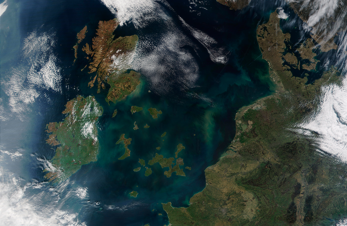
The map above shows the counties of Great Britain (not including Northern Ireland) that voted to remain in the EU following the UK’s referendum on 23 June 2016 as physical islands; islands of remain in the Brexit Sea.
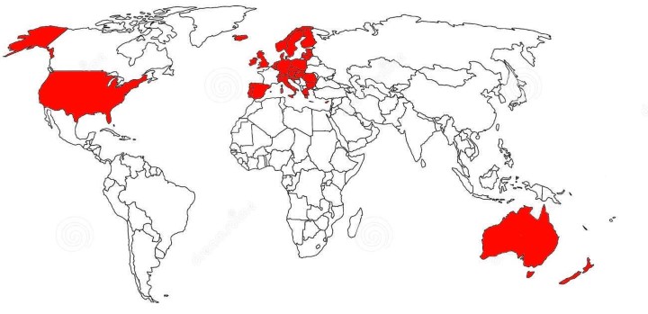
The map above shows countries where the world’s most viral app ever, Pokemon GO, is available.

The two maps above show the impact sectarian violence had on Baghdad’s neighbourhoods in terms of ethnic composition between 2006 and 2007.

The map above shows how the course of the Nile river in Egypt has changed over the past 5,000 years. Additionally, it also shows settlements and Pyramid sites.

The map shows what an independent Republic of Kamchatka, (best known as a territory in Risk) might look like.

The map above shows the results of two separate referendums held in November 1994 on whether or not Norway and/or Sweden would join the EU. The map shows the breakdown by municipality in each country. Keep reading to learn more about each campaign:

The map above shows the town of Springfield from the Simpsons. It was created by Jerry Lerma and Terry Hogan (with the link to their website sadly no longer working) and states it was last revised on May 26th 2004.
This suggests the map is only accurate up to the end of season 15 (the show is currently on season 27).

The map above shows what the Roman City of Londinium (modern day London) might have looked like around 200 AD.