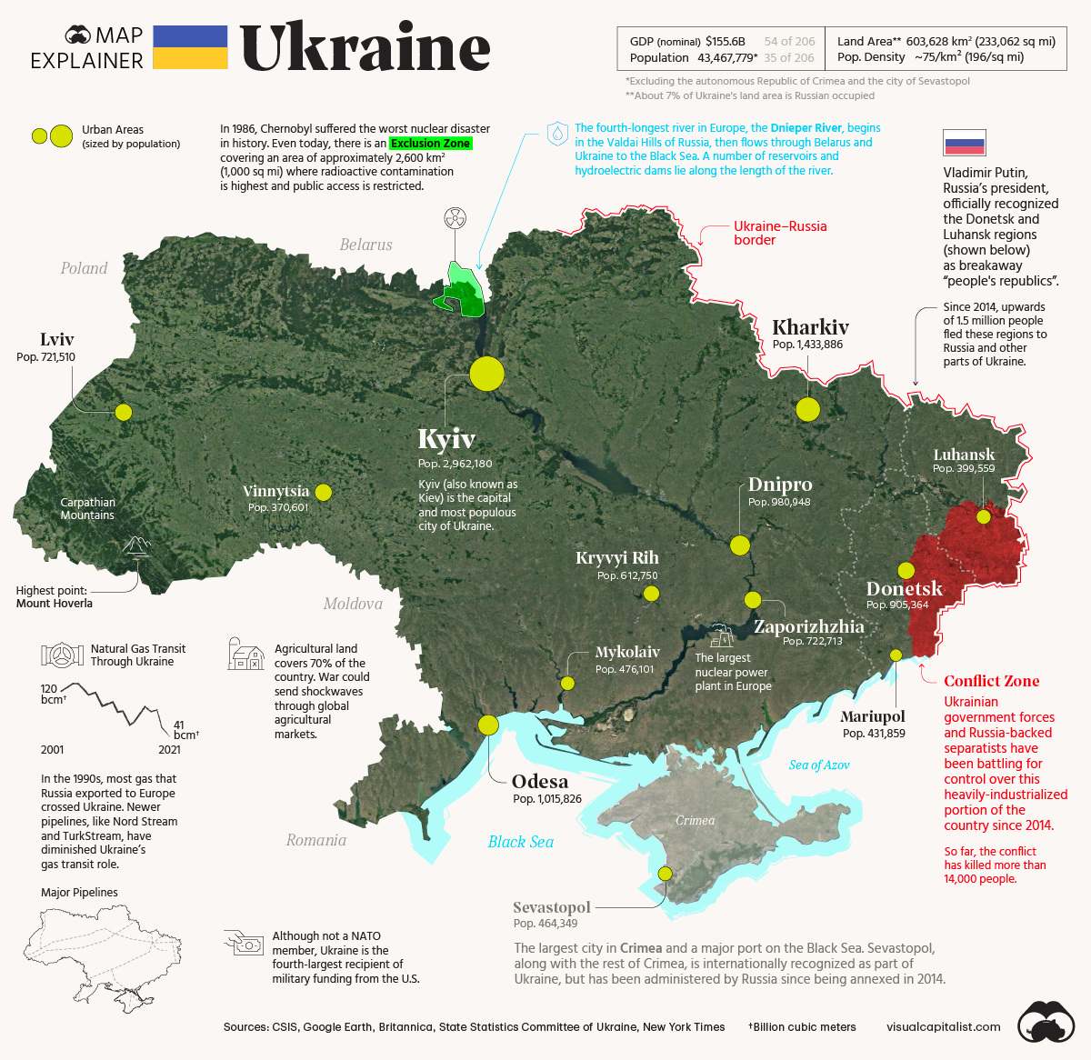
The 2022 map above shows key facts about Ukraine.
Making Sense Of The World, One Map At A Time
The 2022 map above shows key facts about Ukraine.
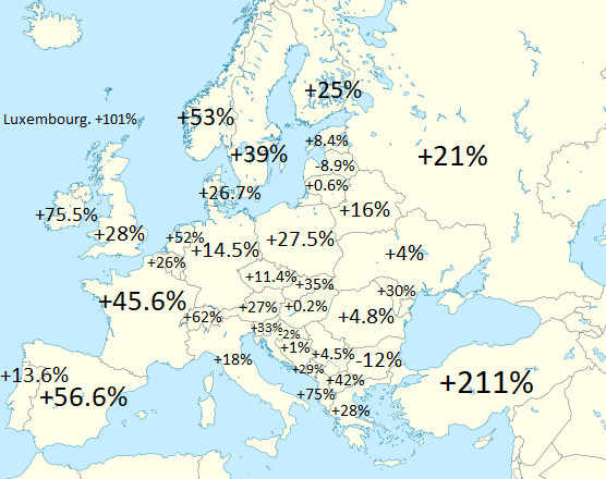
The map above shows the population increase (or decrease of various European countries between 1960 and 2020). Globally world population increased from 3.03 billion to 7.79 billion or a 157% increase.
I’m very please to announce that The Maps for Curious Minds series is back—with 100 vivid infographic maps that transform the way we understand the cultural and historical wonders of North America.
North American Maps for Curious Minds was written by Matthew Bucklan and Victor Cizek and illustrated by Jack Dunnington with a foreword by me (Ian Wright).
Find out the answers to the following questions:
and many, many more.
You can find out more about the book from The Experiment here.
And if you’d like to get your own copy, you can do so from the following stores:
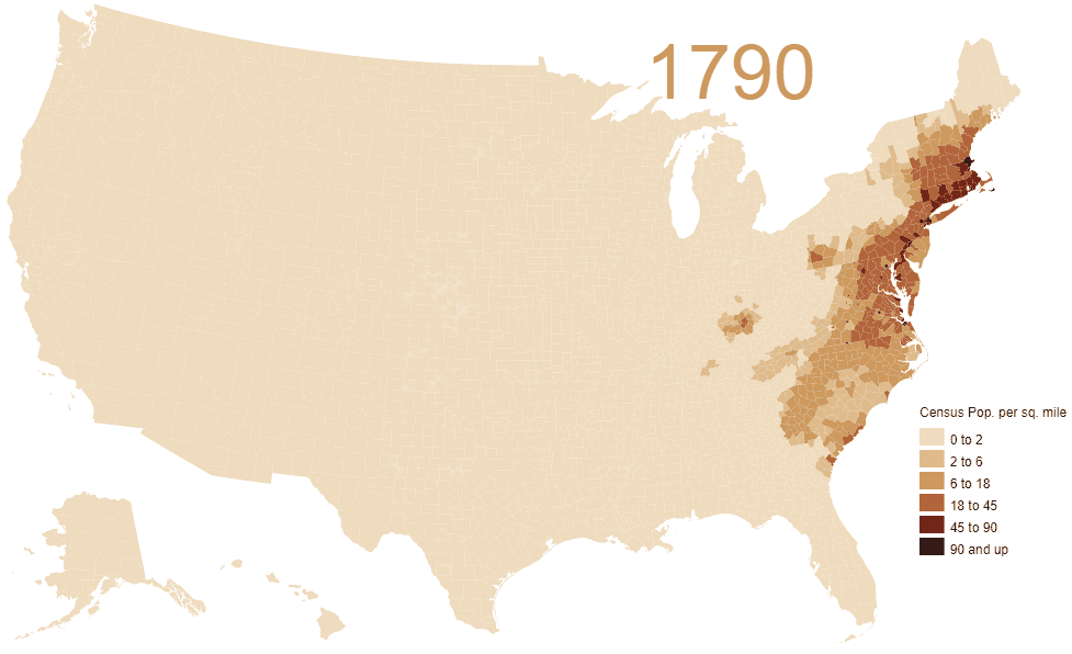
In 1790, population density was just 4.5 people per sq. mile. But by 2010 it had grown to 87.4 people per sq. mile over a much larger area.
From the original map author:
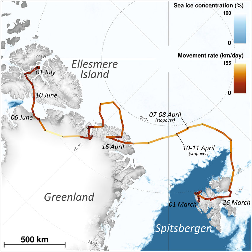
The map above shows the incredible journey of one arctic fox in 2018. Over the course of just a few months she walked up to 155km per day all the way from Svalbard (a Norwegian archipelago) to Canada’s Ellesmere Island via Greenland.
You can read the full story here. And see a picture of the fox here.
Find this map interesting? Please help us by sharing it:
Ever wondered, what would a world map look like if it were centered on Argentina? Well wonder no more. Just have a look at the map above. Of course everything else is incredibly distorted because of the Mercator projection used.
What do you think? Leave your comments below:
The map above shows which Congressional Districts of the 117th Congress voted for or against Donald Trump’s second impeachment by the House of Representatives on January 13, 2021.
You can see how it compares to the 2016 map here.
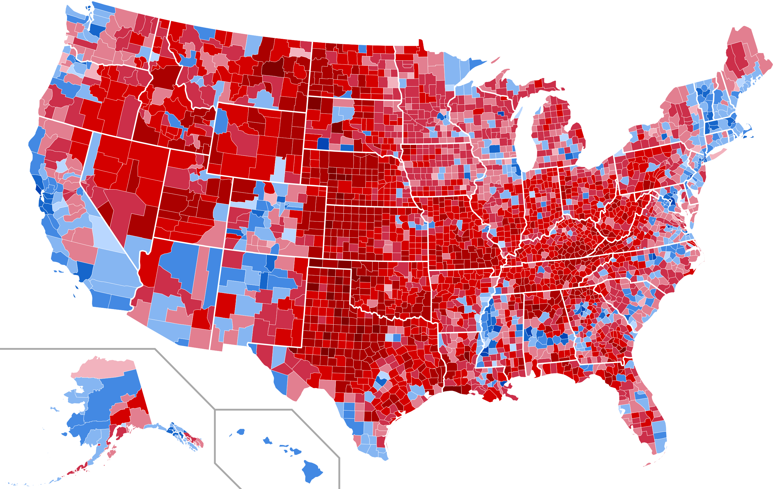
In total, out of the 3,153 counties/districts/independent cities in the US, Trump won the popular vote in 2,595 of them (82.30%) while Biden carried only 558 (17.70%).
So how did Biden win?
The map above shows what the 2020 US Presidential Election results would have been if votes not cast for Biden, Trump or one of the third party candidates had gone to fictional “Did Not Vote” candidate.
The map is a fun look at what the world might look like in 250 million years time assuming no international borders change between now and then.