Brilliant Maps

Making Sense Of The World, One Map At A Time

  • BOOK!
  • Newsletter
  • Board Games
  • Posters
  • Scratch Maps

The Yellow Counties Have More People Than All The Counties In Blue Combined

Last Updated: October 3, 2024 Leave a Comment

Click To Get My 10 Best Brilliant Maps For Free:

The Counties In Yellow Have More People Than All The Counties In Blue

Map created by beansouphighlights
The map of the United States above shows a rather underappreciated fact of America’s human geography. Just 4.5% of U.S. counties contain 50% of the population.

Or put another way, the 142 most populous counties contain 165,858,193 people and the remaining 3,001 counties contain 165,591,088 people according to the 2020 US Census.

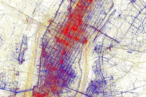
This is not really unique to the US, you can find similar maps for Canada and Australia here.

However, where it does become important is when it comes to politics.

Here’s a county level map of the 2020 presidential election:

2020 presidential election by county

Without knowing that half the country lives in fewer than 5% of counties, you’d think Trump had won a huge landslide, but in fact it was the reverse. You can read more on the topic:

  • 2020 US Presidential Election Map By County & Vote Share
  • 2020 US Presidential Election Map: Biden vs Trump
  • If These 3 Counties Did Not Exist, Trump Would Have Beaten Biden In 2020
  • If “Did Not Vote” Had Been A Candidate In The 2020 US Presidential Election
  • 2016 US Presidential Election Maps By Population Vs Land Area

Find this map interesting? Then please share it:

Filed Under: United States

Click To Get My 10 Best Brilliant Maps For Free:


Other Popular Maps

  • Tourists Vs Locals: 20 Cities Based On Where People Take Photos

    Tourists Vs Locals: 20 Cities Based On Where People Take Photos

  • Map of The Hippie Trail Routes of The 1960s & 1970s

    Map of The Hippie Trail Routes of The 1960s & 1970s

  • Map Of The Most Vegetarian & Vegan-Friendly US States

    Map Of The Most Vegetarian & Vegan-Friendly US States

  • Was Your Country Ever At War With Japan For 102 Years?

    Was Your Country Ever At War With Japan For 102 Years?

  • Biggest Soviet Cities in 1989 & How They’ve Grown or Shrunk Since

    Biggest Soviet Cities in 1989 & How They’ve Grown or Shrunk Since

  • A Map of Every American City

    A Map of Every American City

  • Los Atlantis: What Los Angeles Would Look Like If All The Ice Caps Melted

    Los Atlantis: What Los Angeles Would Look Like If All The Ice Caps Melted

  • Map Showing Number of Golf Courses Per Million People

    Map Showing Number of Golf Courses Per Million People

Leave a Reply Cancel reply

Your email address will not be published. Required fields are marked *

This site uses Akismet to reduce spam. Learn how your comment data is processed.


Product Reviews · World Atlas · Settlers of Catan · Risk · Game of Thrones · Coloring Books
Globes · Monopoly · Star Wars · Game of Life · Pandemic · Ticket To Ride · Drinks Cabinets
US Locations · UK Locations· Fleet Management
Copyright © 2026 · Privacy Policy · Fair Use, Attribution & Copyright · Contact Us
Follow Us: Newsletter · Facebook · Youtube · Twitter · Threads · BlueSky · LinkedIn · Instagram · Pinterest · Flipboard