
Italian Satirical Map Of Europe In 1871

The Italian map titled “L’Europa Geografico-Politica Veduta a Volo d’Oca,” which translates to “The Geographical-Political Europe Seen from a Goose’s Flight,” is a satirical representation of Europe.
It Takes Longer To Drive Across Texas Than It Does Driving From London To Milan

The map above shows how long it takes to drive from one end of Texas to the other (Sabal Palm Sanctuary to Buffalo Springs, Texas 79022, USA).
A distance of 917 miles (1,476 km) and which can easily take over 14 hours.
Percentage (%) of Respondents Who Feel Their Country Takes In Too Many Migrants

Seven out of 10 Europeans believe that their country takes in too many migrants, according to a survey carried out by BVA Xsight for ARTE Europe Weekly, a project led by the French-German TV channel ARTE GEIE and which EL PAÍS has participated in, as part of the countdown to the European elections in June.
You can read the full study here.
Estimated European Black Population By Country In 2020
The map above shows the estimated share of the black population of each European country in 2020. However, the data is not without it’s controversies. Here’s how the results were arrived at:
Estimation Methods Countries with ethnic census (Russia, Ukraine, UK, Ireland) make it straight forwards by merely providing a direct percentage. Another set of countries provide a “migration background” estimate which classifies persons with even one sub-Saharan born grandparent as having “migrant background”, this also provides a near exact ethnic estimate (Germany, Scandinavia, Netherlands, Austria and some Eastern European states).
Now, using the “exact” proportion of sub-Saharan and Caribbean (in the case of Netherlands/UK) descended
blacks to “country of birth” sub-Saharan migrants in the aforementioned countries, we are able to extrapolate a percentage to their neighbours (Italy, Spain, France, Belgium, Portugal, Poland, Czechia, and Hungary) based on the Number of Sub-Saharan born individuals in these respective countries.This provides a near exact estimate with minimal margin of error of the black population in said countries which only have data on individuals who are foreign born or have foreign citizenship.
Sources for the data: Sources and latest available data: UK Census (2011), destatis.de (2019), Eurostat (2019), Russian Registrar (2019), dmsu.gov.ua (2019), scb.se (2019), Irish Census (2016), demo.istat.it (2019), opendata.cbs.nl (2019), ssb.no (2019), statbank.dk (2020), stat.fi (2019), migracje.gov.pl (2018) and ine.es (2019).
Find this map interesting? Please share it using one the sites below:
Percentage of People That Think Their Country Has Benefited From Being In The EU

The map above shows what percentage of people in each EU member state think that the EU has benefited their country. As Landgesit explains:
The exact question in the survey was: “Taking everything into account, would you say that (OUR COUNTRY) has on balance benefited or not from being a member of the EU?”. People could answer this question with “Benefited”, “Not benefited” or “Don’t know”.
2022 Map Of Ukraine Showing Key Facts About The Country
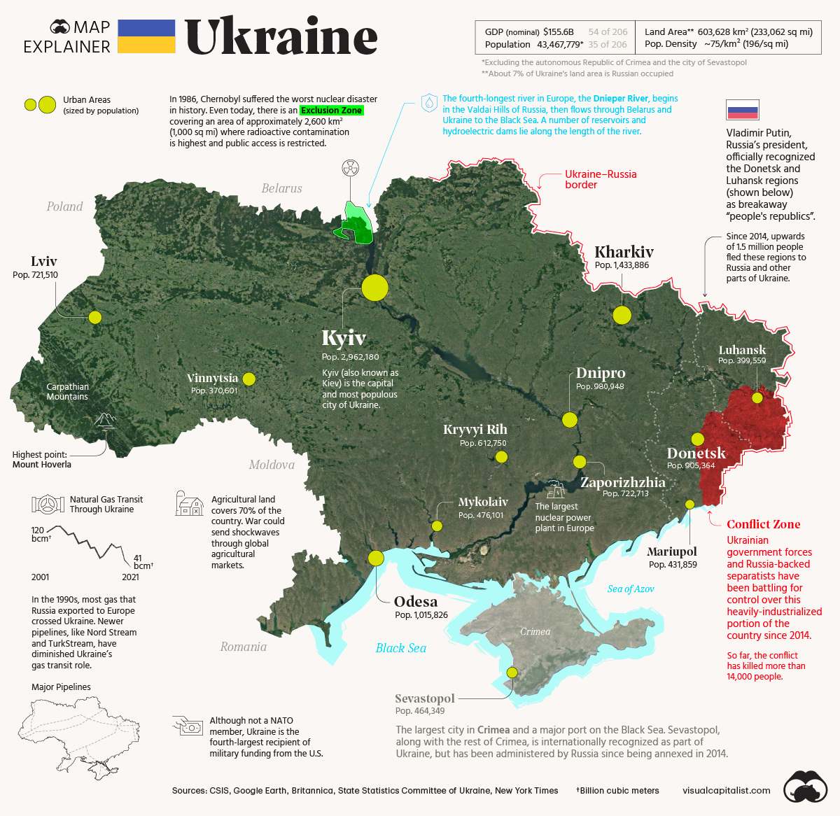
The 2022 map above shows key facts about Ukraine.
Population Growth In European Countries Between 1960 & 2020
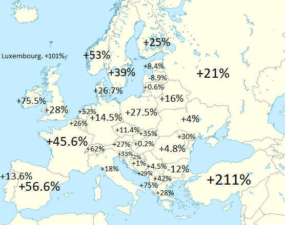
The map above shows the population increase (or decrease of various European countries between 1960 and 2020). Globally world population increased from 3.03 billion to 7.79 billion or a 157% increase.
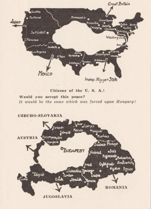
Hungarian Pamphlet From 1920 Protesting The Treaty of Trianon
Migrating Birds In Europe: Map Visualization
- « Previous Page
- 1
- …
- 22
- 23
- 24
- 25
- 26
- …
- 30
- Next Page »