Brilliant Maps

Making Sense Of The World, One Map At A Time

  • BOOK!
  • Newsletter
  • Board Games
  • Posters
  • Scratch Maps

European Countries With A State Religion

Last Updated: August 12, 2024 Leave a Comment

Click To Get My 10 Best Brilliant Maps For Free:

European Countries With A State Religion

Map found on reddit
The map above shows which countries in Europe have some sort of state religion.

Here are the details for each one:

[Read more…]

Filed Under: Europe

What Innocent Opinions Divide European Nations

Last Updated: August 8, 2024 2 Comments

Click To Get My 10 Best Brilliant Maps For Free:

What Innocent Opinions Divide Nations

Map created by Atlasova
This map depicts various innocent opinions that divide countries in Europe into two camps.

Each country is labeled with a particular debate or preference that causes division among its people.

[Read more…]

Filed Under: Europe

Proposed European Time Zones Without Daylight Saving Time

Last Updated: August 13, 2024 4 Comments

Click To Get My 10 Best Brilliant Maps For Free:

New Proposed Time Zones For Europe Without Daylight Saving Time

Map created by Time Use Initiative
The map above shows a proposal for time zones in Europe without Daylight Saving Time (DST).

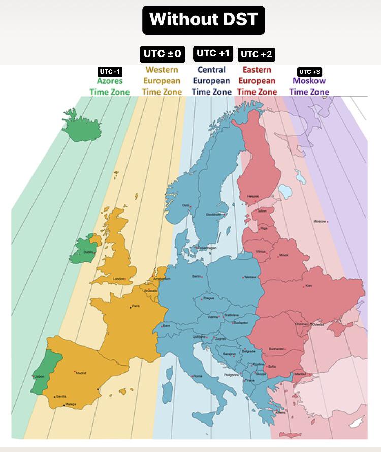
Here’s a breakdown of the map:

[Read more…]

Filed Under: Europe

Map Showing The Spread Of Christianity In 600 AD

Last Updated: July 9, 2024 Leave a Comment

Click To Get My 10 Best Brilliant Maps For Free:

Map Showing The Spread Of Christianity In 600 AD

Map found on reddit
This map shows the geographical distribution of various branches of Christianity around the year 600 AD.

The different colors represent distinct Christian sects, each with its own theological and liturgical traditions.

Here’s a brief description of each branch shown on the map:

[Read more…]

Filed Under: Europe

What Europe Would Look Like If Sea Levels Decreased By 1000 Meters

Last Updated: July 8, 2024 3 Comments

Click To Get My 10 Best Brilliant Maps For Free:

What Europe Would Look Like If Sea Levels Decreased By 1000 Meters

Map found on reddit
The map above shows a hypothetical scenario where sea levels have dropped by 1000 meters, which would result in significant geographical changes across Europe.

Here are some notable observations:

[Read more…]

Filed Under: Europe

Robbery Rate In Europe: What Are The Most Dangerous Cities?

Last Updated: July 8, 2024 2 Comments

Click To Get My 10 Best Brilliant Maps For Free:

Robbery Rate In Europe: What Are The Most Dangerous Cities

Map created by Landgeist
This map illustrates the robbery rate per 100,000 inhabitants across various regions in Europe. The data is color-coded to represent different rates of reported robberies, with the following color scheme:

[Read more…]

Filed Under: Europe

Map Showing The Domains Of The Republic Of Venice In The 15th/16th Century At Its Height

Last Updated: November 25, 2025 Leave a Comment

Click To Get My 10 Best Brilliant Maps For Free:

Map Showing The Domains Of The Republic Of Venice In The 15th/16th Century

Map created by wikimedia user -kayac
This map written in Italian depicts the territories and trade routes of the Republic of Venice in the 15th and 16th centuries at the height of its power. It shows the extent of Venetian influence and control during that time.

Below is the translation of the Italian terms into English:

[Read more…]

Filed Under: Europe, History

Napoleon’s Invasion & Retreat From Russia: “The Best Statistical Graphic Ever Drawn”

Last Updated: June 26, 2024 1 Comment

Click To Get My 10 Best Brilliant Maps For Free:

Napoleon's Invasion & Retreat From Russia: The Best Statistical Graphic Ever Drawn

Created by Charles Minard in 1869
The graphic you above is Charles Joseph Minard’s famous flow map illustrating the disastrous losses suffered by Napoleon’s army in the Russian campaign of 1812-1813.

This map is often cited as one of the best examples of data visualization due to its detailed and multidimensional portrayal of information. And statistician professor Edward Tufte described the graphic as what “may well be the best statistical graphic ever drawn.”

Here are the key elements of the graphic:

[Read more…]

Filed Under: Europe, History

Map Of Napoleonic Europe In 1812 At The Peak Of French Power

Last Updated: June 26, 2024 2 Comments

Click To Get My 10 Best Brilliant Maps For Free:

Map Of Napoleonic Europe In 1812 At The Peak Of French Power

Map created by Alexander Altenhof
This map of Europe in 1812 depicts the continent during the height of French power during the Napoleonic Wars.

The boundaries and political entities shown are reflective of the territorial changes brought about by Napoleon Bonaparte’s conquests and alliances.

Here are some key details:

[Read more…]

Filed Under: Europe, History

Percentage of 15-29 Year Olds Employed In Europe In 2023

Last Updated: June 25, 2024 Leave a Comment

Click To Get My 10 Best Brilliant Maps For Free:

Percentage of 15-29 Year Olds Employed In Europe In 2023

Map created by reddit user Key-Ad8521

The map displays the percentage of 15-29 year olds employed in various regions of Europe in 2023.

It uses a color gradient to indicate the employment rates, with darker blue representing higher employment rates and darker red representing lower employment rates.

The data comes from Eurostat.

Some key facts:

[Read more…]

Filed Under: Europe

  • « Previous Page
  • 1
  • …
  • 20
  • 21
  • 22
  • 23
  • 24
  • …
  • 29
  • Next Page »


Product Reviews · World Atlas · Settlers of Catan · Risk · Game of Thrones · Coloring Books
Globes · Monopoly · Star Wars · Game of Life · Pandemic · Ticket To Ride · Drinks Cabinets
US Locations · UK Locations· Fleet Management
Copyright © 2026 · Privacy Policy · Fair Use, Attribution & Copyright · Contact Us
Follow Us: Newsletter · Facebook · Youtube · Twitter · Threads · BlueSky · LinkedIn · Instagram · Pinterest · Flipboard