Brilliant Maps

Making Sense Of The World, One Map At A Time

  • BOOK!
  • Newsletter
  • Board Games
  • Posters
  • Scratch Maps

8 Maps Showing How The US Fits Into The Rest Of The World

Last Updated: October 8, 2024 3 Comments

Click To Get My 10 Best Brilliant Maps For Free:

How The US Population Fits In Europe

How the US Population Fits in Europe by reddit user jackblack2323
Note: This post was originally written in 2014, and so some of the population figures will have changed somewhat compared to the most recent estimates. 

The US is the third most populous country on earth, with over 320 million people according the current U.S. Census Population Clock. Yet, only around 4.4% of the world’s people live in the country and considering it’s only the 180th most densely populated country on earth, it’s rather sparsely populated.

Moreover, if the US ever wanted to catch-up with China (most populated) or India (soon to be most populated), it would have to increase its population fourfold (1.2 billion+). Even then, this would still only make it the 89th most densely populated country on earth (assuming of course no population changes in any other country).

However, all this can be rather difficult to visualize. Wouldn’t it be easier to just see how the current US population fits into the rest of the world? Well the clever users of reddit have done just that. They’ve created all the maps on this page that help show how large (or not) America’s population really is.
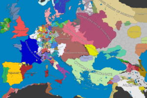
US vs. Europe

(see map at the top of this page)

If the 28 members of the European Union were considered a single country, it would be the third most populous country on earth (knocking the US down to 4th), with a little over 500 million people, living in area that is less than half the size of the entire United States.

The map at the top of the page, shows a combination of European countries that roughly match the population of United States. These are:

  1. Germany (81.7 million)
  2. France (63.6 million)
  3. United Kingdom (62.2 million)
  4. Italy (59.7 million)
  5. Netherlands (16.8 million)
  6. Belgium (11 million)
  7. Czech Republic (10.6 million)
  8. Austria (8.1 million)
  9. Switzerland (7.3 million)

In total, these countries only take up roughly 1.7 million km2 compared to the United States 9.5 million km2. However, the total size of the 9 European economies GDPs only adds up to around $12.7 trillion (IMF, PPP $) compared to the United States $16.8 trillion.

US vs. China

How The US Population Fits In Eastern China

How the US population fits into China by reddit user jackblack2323
So how does the US fit into the most populous country on earth? As the map above shows, you can fit the entire population of the United States into only 4 Chinese provinces. They are:

  1. Shandong Province – population: 95.8 million; capital: Jinan; area: 157,100 km2 (slightly larger than Georgia)
  2. Henan Province – population: 94 million; capital: Zhengzhou; area: 167,000 km2 (slightly smaller than Wisconsin)
  3. Jiangsu Province – population: 78.6 million; capital: Nanjing; area: 102,600 km2 (slightly smaller than Kentucky)
  4. Anhui Province – population: 59.5 million; capital: Hefei; area: 139,700 km2 (about the same size as North Carolina)

However, in terms of economic output, the 4 provinces combined have a GDP of $2.7 trillion, around 1/6th of the US total. However, the map above can also be a bit deceiving.

Similar to the United States, China’s population tends to gravitate to the coast. Unlike the United States, China has only 1 coast, in a country with 4 times more people.

China’s Western provinces by contrast have far fewer people relative to the coastal provinces as the map below demonstrates:

How The US Population Fits In Western China

Map by reddit user gotrees
The map above shows another way you can you can fit the population of the United States into China, but this time using the relatively sparsely populated Western provinces rather than the dense Eastern and Southern ones.

In total you could place the US 4 times in China which would look something like this:

US population fits in China 4 times over

China divided into four regions, each with population greater than the USA by reddit user XeroXenith
US vs. India

How The US Population Fits In India

How the U.S population fits in to India by reddit user babamcrib
The map above shows how you could almost fit the population of the US into the just two Indian states: Uttar Pradesh (199 million people) and Bihar (103 million people). In total these two states are just 335,091 km2 (smaller than Montana) and have a GDP of around $170 billion USD (about the same as Kentucky).

US vs. Southeast Asia (two ways)

How The US Population Fits In South-East Asia Twice

Map by reddit user nomapisperfect
In slightly different twist, here are two different ways you could fit the population of the United States into Southeast Asia.

US vs. Africa

How The US Population Fits In Africa

Map by reddit user Everythingpossible
Here’s how the US could fit into Africa. Note that if you excluded Nigeria (158 million people), you’d have to use a much larger area.

US vs. Arab World

How The US Population Fits In The Arab World

Map by reddit user sebha3alaallah
Finally, the US population could also fit into the Arab countries above. Interestingly the Arab League (which includes all the countries above, not just those in Red) is 13 million km2, about 40% larger than the US, has about 357 million people, yet only has a combined GDP of around $3.3 trillion, about 1/5th of the US total.

Want to learn more? Read:

  • A People’s History of the United States
  • An Indigenous Peoples’ History of the United States (ReVisioning American History)
  • The First Frontier: The Forgotten History of Struggle, Savagery, and Endurance in Early America

Anything you found particularly surprising? Tell us in the comments below.

Filed Under: United States Tagged With: comparison, population

Click To Get My 10 Best Brilliant Maps For Free:


Other Popular Maps

  • US Annual Precipitation vs Rain In London & The UK

    US Annual Precipitation vs Rain In London & The UK

  • Map of Dunder Mifflin Company Branch Locations From the US Office

    Map of Dunder Mifflin Company Branch Locations From the US Office

  • Did You Known Greece Extends Further East Than Istanbul?

    Did You Known Greece Extends Further East Than Istanbul?

  • Maps Showing Beer, Wine Or Spirits: Most Popular Alcoholic Drink By European Country

    Maps Showing Beer, Wine Or Spirits: Most Popular Alcoholic Drink By European Country

  • 1993 InterCity Train Route Map Of Great Britain

    1993 InterCity Train Route Map Of Great Britain

  • A Map of Superheroes in NYC & The Areas They Protect

    A Map of Superheroes in NYC & The Areas They Protect

  • 25 Largest Cities In The Americas By Population (Residing Within City Limits)

    25 Largest Cities In The Americas By Population (Residing Within City Limits)

  • The Most Common Holiday Destination For Europeans?

    The Most Common Holiday Destination For Europeans?

Comments

  1. Civility says

    September 8, 2016 at 5:05 pm

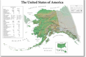
    Does the U.S. land mass configuration include Alaska and Hawaii?

    Reply
    • insect illuminati Get shrekt says

      October 13, 2017 at 10:13 pm

      Why wouldn’t it?

      Reply
  2. Hugh Turley says

    February 9, 2021 at 2:26 pm

    Why don’t you place maps of Korea and Japan inside regions of the USA and see how they compare?

    Reply

Leave a Reply Cancel reply

Your email address will not be published. Required fields are marked *

This site uses Akismet to reduce spam. Learn how your comment data is processed.


Product Reviews · World Atlas · Settlers of Catan · Risk · Game of Thrones · Coloring Books
Globes · Monopoly · Star Wars · Game of Life · Pandemic · Ticket To Ride · Drinks Cabinets
US Locations · UK Locations· Fleet Management
Copyright © 2026 · Privacy Policy · Fair Use, Attribution & Copyright · Contact Us
Follow Us: Newsletter · Facebook · Youtube · Twitter · Threads · BlueSky · LinkedIn · Instagram · Pinterest · Flipboard