
The map above shows the best Mexican chain in each US state and comes from CashNetUSA.
They looked at the following chains:
Making Sense Of The World, One Map At A Time
The map above shows the best Mexican chain in each US state and comes from CashNetUSA.
They looked at the following chains:

The map above shows the best Chicken chain in each US state and comes from CashNetUSA.
They looked at the following chains:

The map above shows the best Donut chain in each US state and comes from CashNetUSA.
They looked at the following chains:

The map above shows the best Pizza chain in each US state and comes from CashNetUSA.
They looked at the following chains:

The map above shows the best Burger chain in each US state and comes from CashNetUSA.
They looked at the following chains:

The map above looks at the best food restaurant in each US state and comes from CashNetUSA. It’s based on Google Map reviews from each brands location.
From the map:
It might be closed on Sundays, but that doesn’t stop Chick-Fil-A — aka the “home of the Original Chicken Sandwich” — from being the best fast-food chain in the greatest number of states (34). The capital A stands for “grade A top quality,” and this certainly seems to be true for states, including Arkansas, Louisiana, and Wyoming.
Below you can you find a map of the worst fast food restaurants in each US state, along with a full list and data for major US cities:
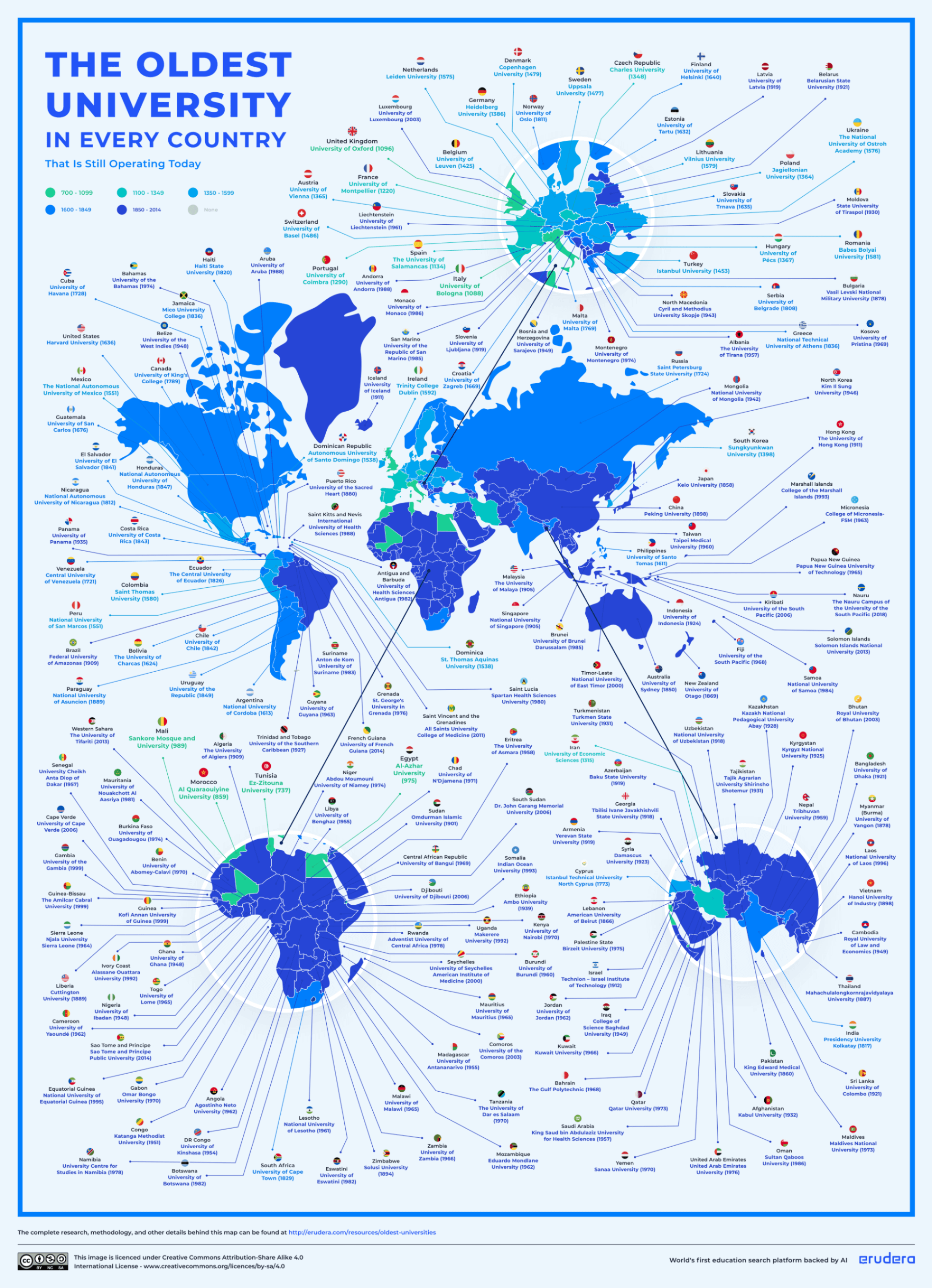
The map above and the maps below shows the oldest university in each country that is still operating today. It was created by Erudera, the world’s first education search engine backed by Artificial Intelligence.
Here are the top 10 oldest universities in the world by country, the year they were founded and where you can find them:

Operation Unthinkable was actually a set of two related contingency plans developed by the British military in 1945 at the end of World War II.

The map above looks at the estimated GDP per capita of various European Regions in 1750, just as the industrial revolution was starting.
On a per capita basis, Northern Italy, The Dutch coast, Southern England and central Spain were among the richest areas.
Now, any estimate of historic GDP involves some guestimating (see: Roman Empire GDP) so here’s how they arrived at this data.

In 2010, Chengdu had no metro to at all, whereas Toronto’s subway system had 4 lines. Fast forward to 2024 and Chengdu has 13 lines with 373 compared to Toronto’s 3 lines and 70 stations.
Here are the two cities and networks compared: