The video above shows a very simplified version of the 21-Year Long Great Northern War using Google Maps.
I was very much inspired to find a video map of the war because of the wonderful The Rest is History series on it.
Here’s more about the war:
Making Sense Of The World, One Map At A Time
The video above shows a very simplified version of the 21-Year Long Great Northern War using Google Maps.
I was very much inspired to find a video map of the war because of the wonderful The Rest is History series on it.
Here’s more about the war:


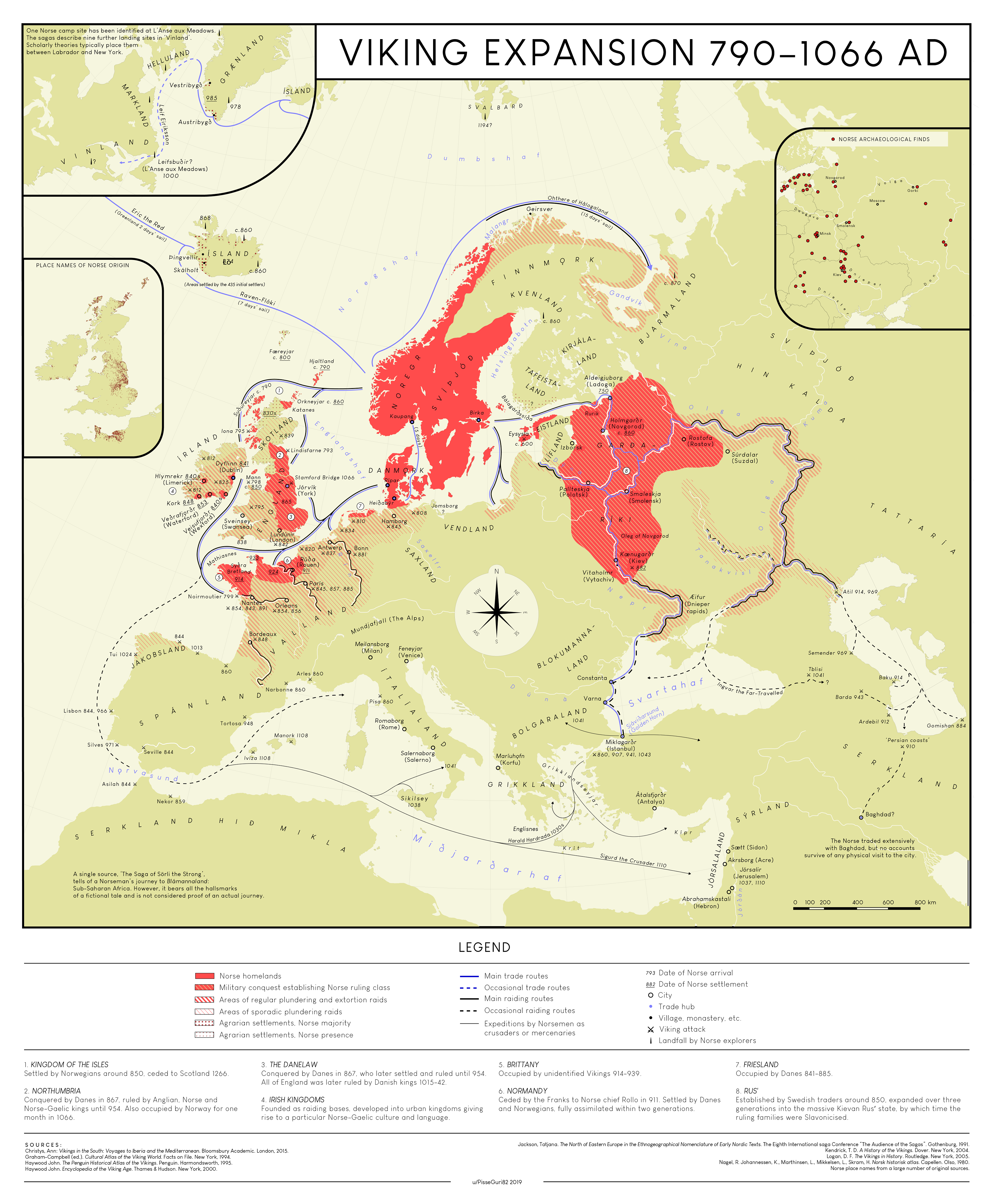 Map created by reddit user PisseGuri82
The map above is a stunningly detailed look at Viking Expansion between 790 and 1066.
Here’s what’s included in the legend:

Do you measure simply based on the city proper? Metropolitan area?
The map above attempts to solve that issue by looking at how many people live with 30km (18.6 miles) of the city centre of each European city. You can quibble that 30km is too much or not enough, but not on the general approach.
Here’s what the author of the map had to say about it:
The video above shows the smallest circle you can make that contains anywhere from 0.1% of the world’s population all the way up to 100% of it.
It comes from reddit user alexmijowastaken who explains that:

More on the sources and pros and cons below:
This video map above shows the numbered highway system in numerical order from Highway 1 all the way to Highway 730.
It excludes the Interstate System.
The video comes from this reddit post, from a user that has since deleted their account.
Here is more about the system and a full list of highways:

Here’s what’s going on:
