
The map above shows how many countries there are in each continent. The numbers may be slightly controversial due to the fact some countries span multiple continents (e.g. Russia, Tukrey, Egypt, France, etc.)
Here is the list used for the map:
Making Sense Of The World, One Map At A Time
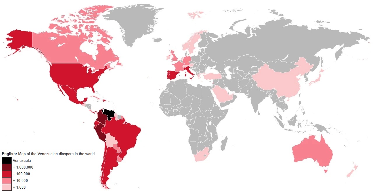
The map above shows the estimated number of Venezuelan’s living in other countries around the world. The table below gives an estimate by country:

From the author of the map:
The short video above shows Jason Girouard’s amazing run around all of Manhattan’s Streets. You can read the full story here, and here’s the main details:

More about them:

The map above shows the share of world GDP for each continent in the world based on nominal exchange rates.
In total, World GDP was $117.165 Trillion $ USD. (Or $208 Trillion in PPP)
Below you can see data in PPP $ and maps and data based on UN Subregions.

The map above shows the IMF’s estimated US Government spending (Federal, State and Local) as share of GDP over the past 223 years.
Here’s the data for all years:

The map above shows the top 10 oil producing countries in 1939. Three big things stand out to me:

They explain that:

Support for remaining a Monarchy was strongest in: