Brilliant Maps

Making Sense Of The World, One Map At A Time

  • BOOK!
  • Newsletter
  • Games & Quizes
  • Map Based Polls
  • Map Tools

What If The United States Collapsed Like The Soviet Union

Last Updated: August 19, 2024 Leave a Comment

Click To Get My 10 Best Brilliant Maps For Free:

What If The United States Had Collapsed Like The Soviet Union

Map created by Marko Jukic
The map imagines “If the United States broke apart like the Soviet Union…” did in 1991.

The map draws parallels between the breakup of the Soviet Union into independent republics and a hypothetical disintegration of the U.S. into regional states.

Key Details from the Map:

[Read more…]

Filed Under: Other

Map Of The Columbian Exchange

Last Updated: June 29, 2026 4 Comments

Click To Get My 10 Best Brilliant Maps For Free:

Map Of The Columbian Exchange

Map found on reddit
This map illustrates the Columbian Exchange, a significant event following Christopher Columbus’s voyages to the Americas.

The exchange represents the widespread transfer of plants, animals, culture, human populations, technology, and diseases between the Americas, Europe, Africa, and Asia.

Key Points in the Graphic:

  1. Items Transferred from the Americas (North and South) to Europe, Africa, and Asia:
    • Crops: Potato, Corn, beans, squash, tomato, peanut, cassava, avocado, sweet potato, peppers, pineapple, and pumpkin.
    • Livestock/Animals: Turkey.
    • Other: tobacco, cacao bean, vanilla, and quinine (a treatment for malaria)
  2. Items Transferred from Europe, Africa, and Asia to the Americas:
    • Crops: Wheat, rice, barley, oats, sugar cane, banana, coffee bean, peach, pear, olive, citrus fruits, grape, onion, and turnip.
    • Livestock/Animals: Livestock like cattle, sheep, pig, and horse; honeybee.
    • Diseases: Smallpox, influenza, typhus, measles, malaria, diphtheria, and whooping cough.

Significance:

The Columbian Exchange profoundly transformed food and cuisine across all continents, leading to significant changes in diets, agriculture, and culinary traditions.

Here’s how it affected each continent:

The Americas:

  • Introduction of European Crops and Livestock:
    • Before the Columbian Exchange, the Americas lacked domesticated animals like cattle, pigs, and horses. The arrival of these animals introduced new sources of protein and fundamentally changed agricultural practices.
    • Wheat, rice, and barley became staple crops in many regions, especially in North America, influencing the development of bread-based diets and cuisines.
  • New Culinary Traditions: European grains and livestock combined with Indigenous crops like corn, beans, and potatoes led to the development of hybrid cuisines, such as dishes that blended European techniques with Native American ingredients.

Europe:

  • Increased Variety and Nutrition:
    • The introduction of staple crops like potatoes, tomatoes, maize (corn), and beans revolutionized European diets. The potato, in particular, became a crucial food source in countries like Ireland and Russia, leading to population growth and improved nutrition.
    • Tomatoes transformed Mediterranean cuisine, leading to dishes like Italian pasta with tomato sauce and Spanish gazpacho. Chocolate (from cacao beans) and vanilla became luxury items and later integral parts of European desserts.
  • Expansion of Global Trade: The demand for sugar from the New World led to the establishment of large plantations in the Caribbean, reshaping global trade and cuisine through the widespread availability of sweetened foods.

Africa:

  • Introduction of New Crops: Maize (corn), cassava, and peanuts became essential crops in many parts of Africa, where they adapted well to local climates. Cassava and maize, in particular, became staple foods in West and Central Africa, significantly impacting local cuisines and diets.
  • Dietary Changes: The introduction of these calorie-dense crops led to population growth in certain regions. Traditional African dishes like fufu and various porridges started incorporating these new ingredients.

Asia:

  • Adoption of New Ingredients: Crops like chili peppers, sweet potatoes, and peanuts were introduced from the Americas and quickly integrated into Asian cuisines. Chili peppers, for example, became integral to Indian, Thai, and Chinese cooking, transforming spice blends and flavor profiles.
  • Expansion of Staple Crops: The introduction of maize, potatoes, and sweet potatoes in China helped sustain large populations, especially in areas where rice or wheat cultivation was difficult.

General Impact Across Continents:

  • Globalization of Ingredients: Foods that were once region-specific became global staples. For instance, Italian, Indian, and Thai cuisines are unimaginable without tomatoes or chili peppers, which originated in the Americas.
  • Fusion and Hybrid Cuisines: The blending of indigenous and introduced ingredients led to new culinary traditions. For example, Creole cuisine in the Caribbean is a mix of African, European, and Native American influences.
  • Increased Food Security and Population Growth: The introduction of high-calorie crops like potatoes and maize led to better food security in Europe, Asia, and Africa, fueling population booms and the growth of cities.

Here’s another map showing the process: 
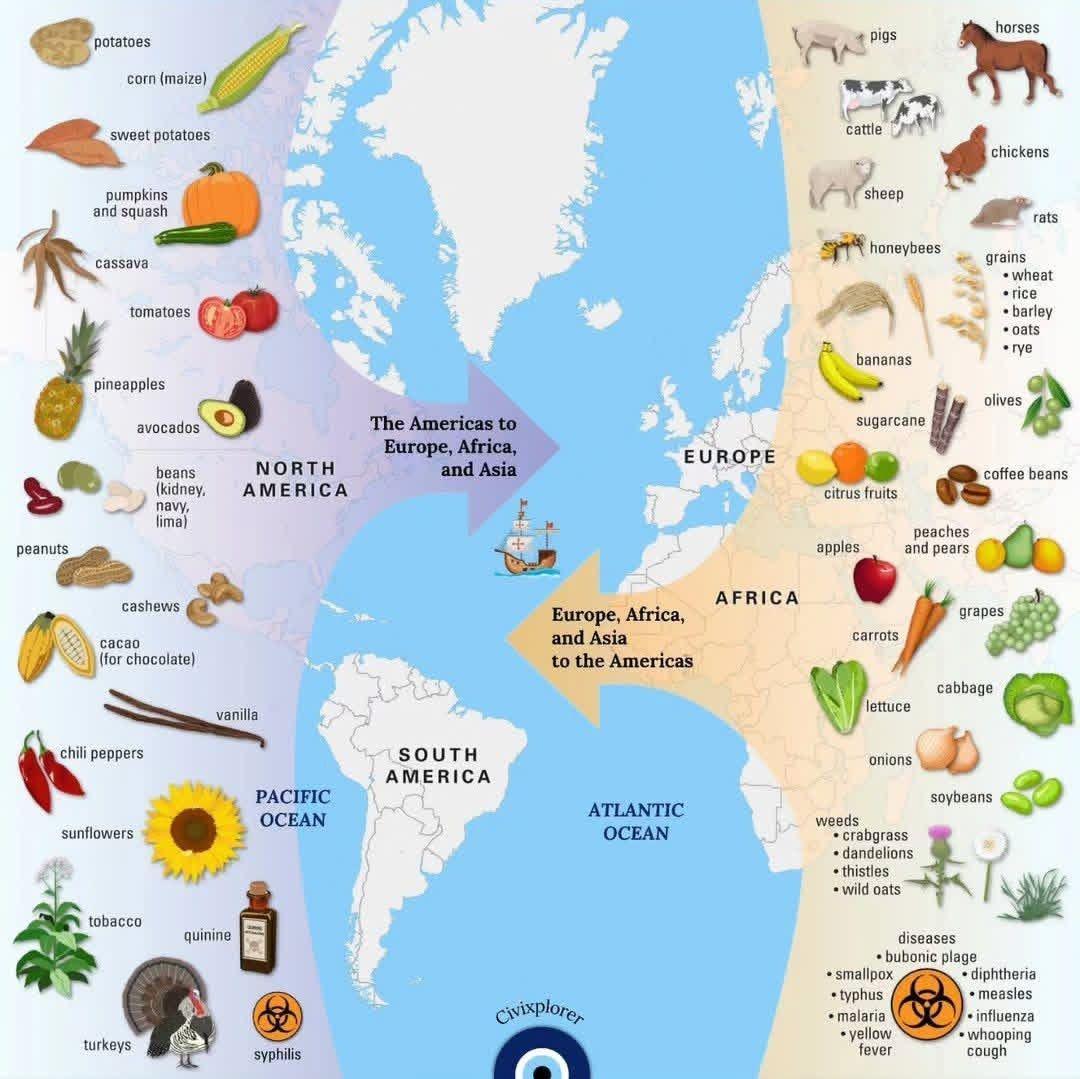
Map of the Columbian Exchange

Map created by Civiexplorer

Filed Under: History

Oregon Counties That Voted to Leave And Join Idaho (2020 – 2024)

Last Updated: August 17, 2024 1 Comment

Click To Get My 10 Best Brilliant Maps For Free:

Oregon Counties That Voted to Leave And Join Idaho (2020 - 2024)

Map created by reddit user seashellvalley760
This map shows the results of votes in several Oregon counties between 2020 and 2024 on whether to leave the state of Oregon and join Idaho.

This is part of a movement known as the “Greater Idaho” movement. The map highlights counties where residents voted on this issue, with shades indicating the level of support for leaving Oregon.

Here’s a video explaining it:

[Read more…]

Filed Under: Uncategorized

Total Summer Olympic Medals Won By Country 1896-2024

Last Updated: February 5, 2026 3 Comments

Click To Get My 10 Best Brilliant Maps For Free:

Total Summer Olympic Medals Won By Country 1896-2024

Map found on reddit
This map above shows the total number of Summer Olympic medals won by each country since the modern games began in 1896. The map is color-coded, with darker shades representing countries with more medals and lighter shades indicating fewer or no medals.

Key observations:

[Read more…]

Filed Under: World Maps

Beer Prices In Europe: How Much For A Pint?

Last Updated: August 16, 2024 Leave a Comment

Click To Get My 10 Best Brilliant Maps For Free:

Beer Prices In Europe For A Pint

Map found on reddit
This map presents a visual representation of the average prices for a 0.5-liter domestic draught beer (68ml short of a pint) in restaurants across Europe, measured in euros (€).

The map color-codes different countries according to the price range of beer, with the following categories:

[Read more…]

Filed Under: Uncategorized

Percentage of People Who Believe In Life After Death

Last Updated: August 16, 2024 Leave a Comment

Click To Get My 10 Best Brilliant Maps For Free:

Percentage of People Who Believe In Life After Death

The two maps here were created by The World Maps. The one above looks at percentage of people who believe in life after death around the world. Data comes from the World Values Survey conducted between 2017 and 2022.

The countries are color-coded according to the percentage range of people who hold this belief:

[Read more…]

Filed Under: World Maps

Watch The Earth Breathe

Last Updated: August 16, 2024 Leave a Comment

Click To Get My 10 Best Brilliant Maps For Free:

In this visualization, NASA instruments show the seasonal cycle of vegetation and the concentration of carbon dioxide in the atmosphere.

[Read more…]

Filed Under: World Maps

Population Change In Europe vs Arab World 1990-2022

Last Updated: October 1, 2026 Leave a Comment

Click To Get My 10 Best Brilliant Maps For Free:

Population Change In Europe vs Arab World 1990-2022

Map created by @mmjukic
The map above displays total population change from 1990 to 2022 across various European and Arab countries.

The colors represent different rates of population growth or decline, with green shades indicating growth and red shades indicating decline.

[Read more…]

Filed Under: Europe

Map Of The Old World In 1200 On The Eve Of The Mongol Invasions

Last Updated: August 16, 2024 1 Comment

Click To Get My 10 Best Brilliant Maps For Free:

Map Of The Old World In 1200AD On The Eve Of The Mongol Invasions

Map created by Thomas Lessman
This map of the Eastern Hemisphere in 1200 AD depicts the world just before the rise of the Mongols and highlights a variety of significant states and civilizations.

Here are a few key regions and states featured in the map:

[Read more…]

Filed Under: World Maps

Map of Italy & Illyria in 1084

Last Updated: August 16, 2024 Leave a Comment

Click To Get My 10 Best Brilliant Maps For Free:

Map of Italy & Illyria in 1084

Map created by MapMaster
This map depicts Italy and parts of the western Balkans (referred to as Illyria) around the year 1084 AD, during the High Middle Ages. Here is an overview of the different regions, states, and entities shown on the map:

[Read more…]

Filed Under: Europe

  • « Previous Page
  • 1
  • …
  • 103
  • 104
  • 105
  • 106
  • 107
  • …
  • 159
  • Next Page »


Product Reviews · World Atlas · Map Posters · Settlers of Catan · Risk · Game of Thrones · Coloring Books · Globes · Monopoly · Star Wars · Game of Life · Pandemic · Ticket To Ride · Drinks Cabinets
Size Comparisons · US Locations · Flight Maps · Fleet Management
Copyright © 2026 · Privacy Policy · Fair Use, Attribution & Copyright · Contact Us
Follow Us: Newsletter · Facebook · Youtube · Twitter · Threads · BlueSky · LinkedIn · Instagram · Pinterest · Flipboard