
The map above is an interesting way to re-imagine the world, using river basins as the borders for countries. From the author:
Making Sense Of The World, One Map At A Time
The map above is an interesting way to re-imagine the world, using river basins as the borders for countries. From the author:

The map above shows how democratic they feel their government and country to be.
The data comes from the Democracy Perception Index, and is not an objective measure of democracy but a subjective measure of how democratic they perceive their country as being.
Only about half the world (58%) says their country is democratic. Greece is considered the least democratic by its people (43%) out of all countries labeled as “free” democracies by Freedom House.
Most Democratic:
Least Democratic:
And here’s how important democracy is as being:
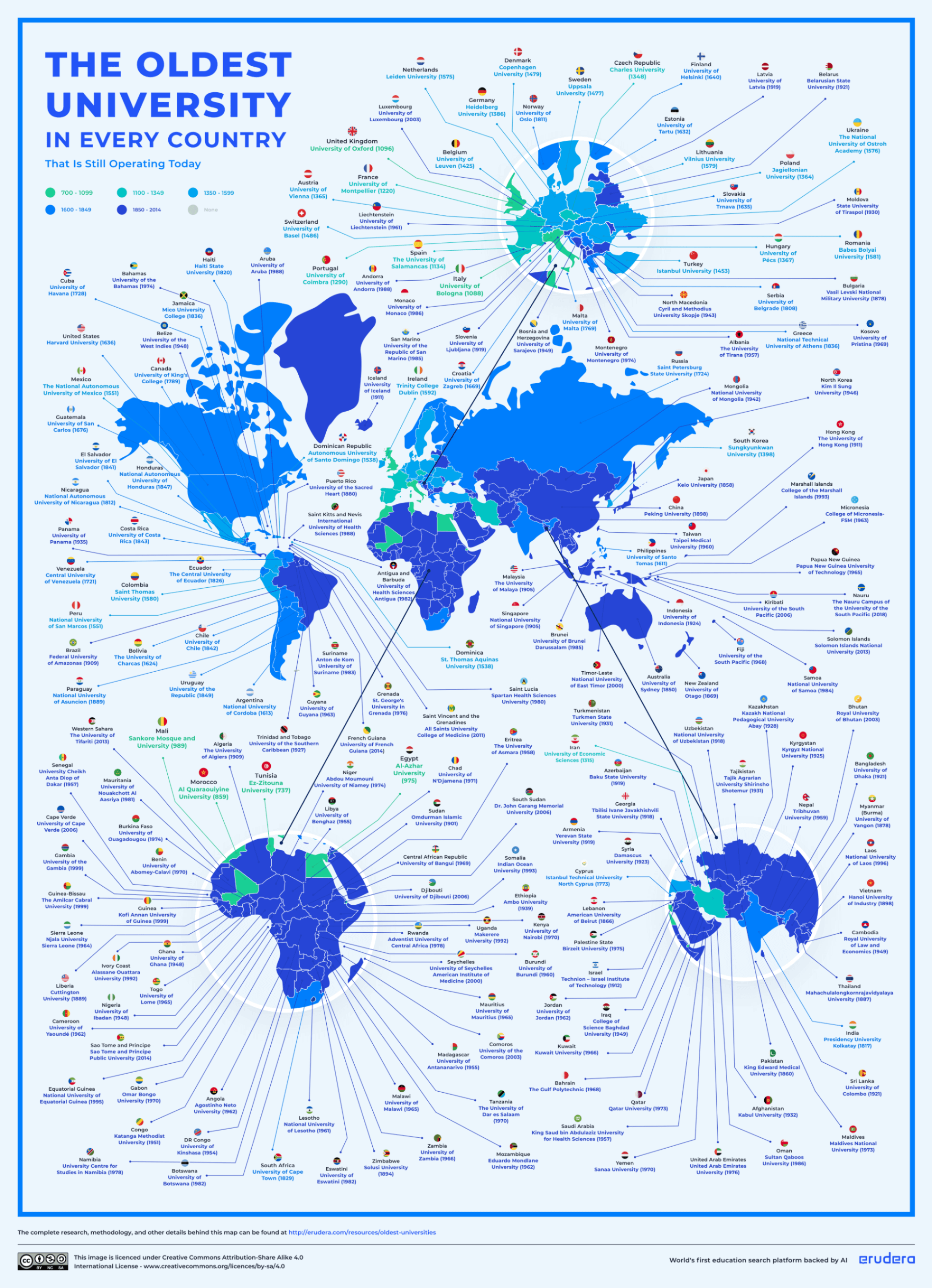
The map above and the maps below shows the oldest university in each country that is still operating today. It was created by Erudera, the world’s first education search engine backed by Artificial Intelligence.
Here are the top 10 oldest universities in the world by country, the year they were founded and where you can find them:

Ocean salinity refers to the concentration of dissolved salts in seawater, typically measured in parts per thousand (ppt) or practical salinity units (PSU). The average salinity of ocean water is between 34 and 36 ppt, meaning that for every 1,000 grams of seawater, between 34 and 36 grams are salt.
Here is an another map showing the same phenomenon:

This type of map is also sometimes referred as a world map from a fish’s point of view.
From the map:

In the year 1 AD it was probably somewhere in around the borders between modern day Pakistan and Afghanistan.
1,000 years later and it barely shifted.

The map above shows where you can find them, although it uses an odd colour scheme where darker means fewer nematodes and lighter means more.
But what are nematodes?

Tectonic plates are massive slabs of solid rock that float on the semi-fluid asthenosphere beneath them and move relative to one another.
The movement of these plates can cause earthquakes, volcanic activity, mountain building, and ocean trench formation.
Here is an overview of each major plate shown in the map:
The map above shows which country is responsible for the largest defeat at men’s senior level association football. Interestingly, England appears most often on the map despite not winning a World Cup since 1966.
Flag indicates the winner in each country’s largest ever defeat in men’s senior-level association football.
If a country has lost by the same record margin multiple times, the most recent match is used.
For countries that no longer exist (e.g., Soviet Union, Yugoslavia), the official FIFA-recognized successor team is used.
The data comes from Wikipedia and was accurate as of 2022.

However, over 200 years ago in 1800, it had an estimated population of 29 million people making it possibly the world’s 4th most populous country at that time.
Here’s a list of countries by when they overtook France’s population and when it happened (with current population in brackets):