The interactive global sound map below is one of the cooler and more original map concepts we’ve come across. It let’s you listen to sounds from around the world.
Making Sense Of The World, One Map At A Time
Last Updated: Leave a Comment

The interactive global sound map below is one of the cooler and more original map concepts we’ve come across. It let’s you listen to sounds from around the world.
Last Updated: 22 Comments

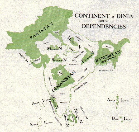
The map above was created by Choudhry Rahmat Ali, who was a Pakistani nationalist and is often credited with coming up with the name ‘Pakistan.’
Last Updated: Leave a Comment

While the Jackson Pollock style map of The Situation in Syria above is obviously not meant to be taken literally, it does a illustrates just how chaotic the situation remains.
Last Updated: Leave a Comment
Brilliant Maps is now just over 1 year old. Since launching we’ve made a total of 167 posts. So we thought now was as good a time as any to look back at what the 15 best and most popular maps were for 2015 (based on the number of visitors).
If you were one of them, then a huge thank you! It means a huge amount to everyone at Brilliant Maps that you obviously love maps as much as we do.
We’re continually doing our best to bring you maps we think tell interesting stories. We’ve obviously gotten that right many times over the past year, but perhaps more interesting are the maps that didn’t quite find an audience.
Last Updated: 9 Comments

If you’re not following @sadtopographies on Instagram, you should. The account shows the places with saddest and most depressing names on earth.
Examples include everything from Cape Disappointment to Point No Point to Sad Road. And while Americans and Australians are usually thought to have sunny dispositions they also have a lot of unfortunate place names.
21 of our favourites are included below:
Last Updated: 2 Comments
Kiribati is one of those countries you never hear anything about yet has some very unique and interesting geographic anomalies. These 3 maps created by reddit user evening_raga show a few facts about this overlooked part of the world.
Last Updated: 6 Comments

The map above shows the relative position of major European cities if they were suddenly moved to Texas. Depending on your point of view, it either shows that Texas is really big or Europe is very small.
Last Updated: 6 Comments
With the New Horizons probe putting Pluto back in the news, just how big is it?
Last Updated: 8 Comments
The map above shows a rather surprising and counterintuitive fact, Europe’s population is not only relatively further north than America’s, but even further north than Canada’s!
Last Updated: 15 Comments