The map above shows the percentage of residents in various European countries who are willing to fight and go to war for their country.
Full results below:
Making Sense Of The World, One Map At A Time
The map above shows the percentage of residents in various European countries who are willing to fight and go to war for their country.
Full results below:
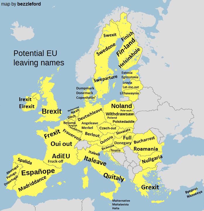
The map above shows potential exit names European Union countries could use if they decided to leave the EU in the same way as the UK did via “Brexit.”
A full list can be found below, including some additional ones that are not on the map, but were part of the original Reddit threads.

The map above shows the European countries (in red) that have invaded Poland (in black) at some point in history. As with all maps using modern borders to show historical events, there are of course issues.

The map above shows what Europe’s borders looked on the eve of World War One in 1914, overlaid on top of the borders of European countries today. The first thing that jumps out at you is how many fewer countries there were.

As difficult as it is to believe, the black and blue areas above, each have exactly the same number of people living in the them.

The map above shows the results of two separate referendums held in November 1994 on whether or not Norway and/or Sweden would join the EU. The map shows the breakdown by municipality in each country. Keep reading to learn more about each campaign:

The map above shows the distribution of Celtic language speakers in Europe in the early 21st century.

The European Green Belt is the backbone of a pan-European ecological network that runs for 12,500 kilometres from the Barents Sea in the north to the Adriatic and Black seas in the south.

The map above shows which European countries are taking in the largest numbers of Syrian refugees both in absolute and relative terms.

The map above shows the Byzantine linguistic divisions of the Byzantine (Eastern Roman) Empire during the rule of Justinian I around 560 CE (AD).