
The map above is another work of Yanko Tsvetkov in his Atlas of Prejudice series.
It shows 12 different ways you can separate the US into different regions.
They are:
[Read more…]
Making Sense Of The World, One Map At A Time
The map above is another work of Yanko Tsvetkov in his Atlas of Prejudice series.
It shows 12 different ways you can separate the US into different regions.
They are:
[Read more…]

The two maps here show how few countries have a claim to having once had the world’s tallest building and/or free standing structure since 4,000 BC.

The map above shows how many cities above a million people each country has. Is suspect it comes from this list on Wikipedia, but is now slightly out of date.

Yellow: More common for the piece to be captured there.
Purple: Less common.

Here’s desfirsit explaining what he did:

However, when looking through I did spot a few errors.

And as noted by Jakub:
Please note that when there are two forms of a name that differ only by the inclusion of the word “language”, the map shows the more common variant. For example, Polish is called either język polski or polszczyzna, but the former variant is significantly more common than the latter one, so it is the one shown in the map.

The two maps here are poke fun at the idea of how both Americans and Europeans feel about travelling to each other’s countries.
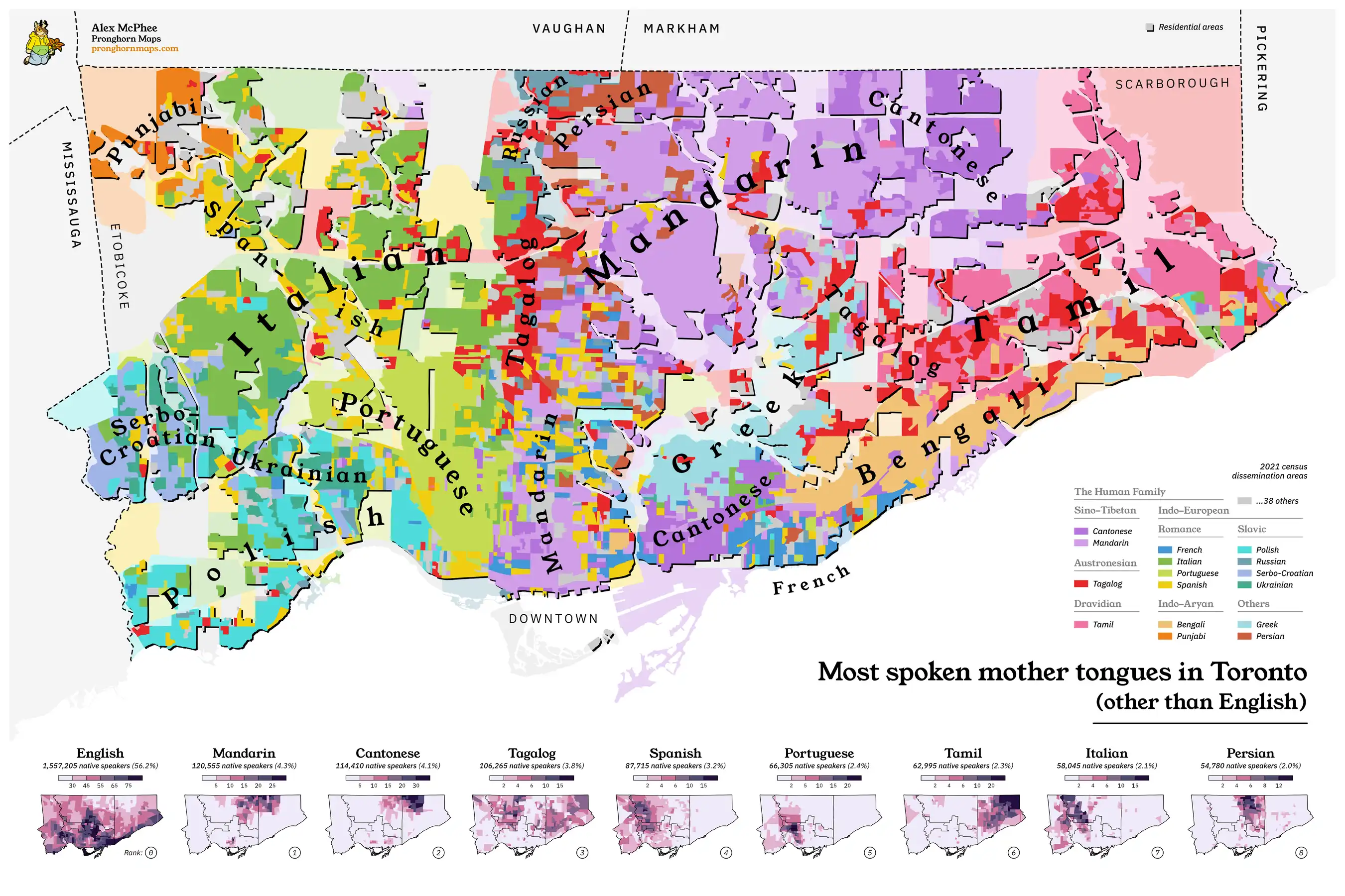
The map above and below are both the work of Alex McPhee, aka Pronghorn maps.
And you can buy both of them on his website here.
Below is my purely subjective list of the 17 oddest and weirdest shaped countries in world and why they are the shaped the way they are.