Brilliant Maps

Making Sense Of The World, One Map At A Time

  • BOOK!
  • Newsletter
  • Board Games
  • Posters
  • Scratch Maps

4 Maps That Put China’s & India’s Populations Into Perspective

Last Updated: July 24, 2024 1 Comment

Click To Get My 10 Best Brilliant Maps For Free:

China's population compared

Map comparing China’s population to other major countries by reddit user TeaDranks
Note this post is originally from 2015 and some of the population numbers have since changed the main one being India now has more people than China.

TeaDranks, creator of the widely popular World Population Cartogram, is back again with 4 new population inspired maps.

Similar to one of our earlier posts about 8 ways the US fits into the rest of the world, these maps show which countries’ populations would fit inside China and India, the world’s most and second most populous nations.

The first map above shows just how many large countries it would take to equal the population of China. However, the maps below are if anything more surprising. Please note all 4 maps on this page are the work TeaDranks, who deserves all the credit.

China's population compared to the world's smallest countries

China compared to the world’s smallest countries
China has 21 million more people than the 177 smallest countries on earth put together. Or to put it another way, only 33 countries are excluded from the map above. One of which is India:

China's population compared to India and the Philippines

China compared to India and the Philippines
Yet, you can also look at the population of China another way. India’s population of 1.252 billion people plus that of the Philippines’ 98.39 million (12th largest) roughly equals China’s 1.357 billion people.

However, with population growing faster in India than China, the two countries are forecast to meet at roughly 1.4 billion each sometime before 2030, assuming of course current trends continue (they very well may not).

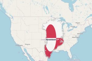
And just in case you though India was somehow a small country, have a look at the 4th and final map:

India's population compared

Population of India compared to Africa, United Kingdom and South Korea combined
As difficult as it may be to believe, India has more people than the continent of Africa (1.111 billion), United Kingdom (64.1 million) and South Korea (50.22 million) combined.

The picture will look quite different by 2050, if current trends continue. At that point, Africa is projected to have 2.4 billion people, India 1.7 billion, United Kingdom 71 million and South Korea 43 million (which could increase if it reunifies with the north before then).

Like to learn more about world population? Then have a look at:

  • Seven Billion and Counting: The Crisis in Global Population Growth
  • Limits to Growth: The 30-Year Update
  • Countdown: Our Last, Best Hope for a Future on Earth?

Have any comments about the maps above? Leave them below:

Filed Under: World Maps Tagged With: population

Click To Get My 10 Best Brilliant Maps For Free:


Other Popular Maps

  • One State? Demographic Maps Of Israel & Palestine

    One State? Demographic Maps Of Israel & Palestine

  • The Town of Rjukan, Norway Is In Perpetual Shadow For 6 Months Of The Year

    The Town of Rjukan, Norway Is In Perpetual Shadow For 6 Months Of The Year

  • The World According To Apple Look Around (aka Apple Maps Street View)

    The World According To Apple Look Around (aka Apple Maps Street View)

  • School Shootings: US vs Europe Maps

    School Shootings: US vs Europe Maps

  • Light Pollution Around The World

    Light Pollution Around The World

  • Map Showing Darkest Legal Front Side Window Tint by US State

    Map Showing Darkest Legal Front Side Window Tint by US State

  • Territories Still Under Japanese Control At The Time Of Their Surrender On 15 August 1945

    Territories Still Under Japanese Control At The Time Of Their Surrender On 15 August 1945

  • Oldest College or University in Every US State

    Oldest College or University in Every US State

Comments

  1. Dave Morley says

    May 21, 2025 at 2:52 pm

    Many independent researchers now believe that China’s population is in reality dramatically less you have used in preparing this map. Many say 800 million and a couple say as few as 350 million. You should revisit this map on the basis that it may well be very deceptive- just like the CCP.

    Reply

Leave a Reply Cancel reply

Your email address will not be published. Required fields are marked *

This site uses Akismet to reduce spam. Learn how your comment data is processed.


Product Reviews · World Atlas · Settlers of Catan · Risk · Game of Thrones · Coloring Books
Globes · Monopoly · Star Wars · Game of Life · Pandemic · Ticket To Ride · Drinks Cabinets
US Locations · UK Locations· Fleet Management
Copyright © 2026 · Privacy Policy · Fair Use, Attribution & Copyright · Contact Us
Follow Us: Newsletter · Facebook · Youtube · Twitter · Threads · BlueSky · LinkedIn · Instagram · Pinterest · Flipboard