Brilliant Maps

Making Sense Of The World, One Map At A Time

  • BOOK!
  • Newsletter
  • Board Games
  • Posters
  • Scratch Maps

Brilliant Maps vs Terrible Maps

Last Updated: August 12, 2026 Leave a Comment

Click To Get My 10 Best Brilliant Maps For Free:

Brilliant Maps vs Terrible Maps

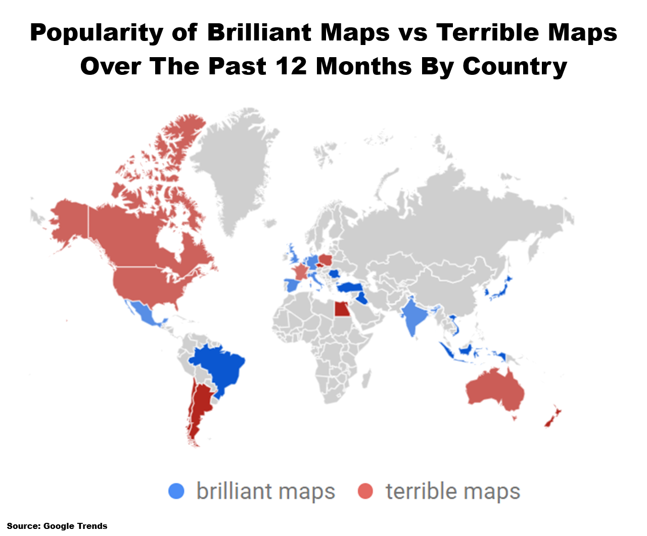
The map above is just a fun look at the Google Trends for Brilliant Maps compared to Terrible Maps over the past 12 months.

Congrats to Michael Howe at Terrible Maps for winning the US, my home country of Canada, Australia and the biggest map prize of all New Zealand.

My only consolation is that I “won” 3 out of the 4 countries I’ve ever lived in.

Here is the relative share by country:

Countrybrilliant maps: (8/12/25 - 8/12/26)terrible maps: (8/12/25 - 8/12/26)
Argentina0%100%
Australia38%62%
Belgium100%0%
Brazil100%0%
Canada41%59%
Chile0%100%
Czechia0%100%
Egypt0%100%
France49%51%
Germany55%45%
India51%49%
Indonesia100%0%
Iraq100%0%
Italy57%43%
Japan100%0%
Mauritius100%0%
Mexico51%49%
Netherlands56%44%
New Zealand0%100%
Poland30%70%
Romania100%0%
South Korea100%0%
Spain56%44%
Turkey100%0%
United Kingdom57%43%
United States42%58%
Vietnam100%0%

Although the fact that there is no data for most of the world is probably the most interesting stat of all.

Filed Under: World Maps

Click To Get My 10 Best Brilliant Maps For Free:


Other Popular Maps

  • Italian GRDP Per Capita By Italian Region In USD

    Italian GRDP Per Capita By Italian Region In USD

  • The 15 Countries Richer Than The US In 1980 & How They Are Doing In 2025

    The 15 Countries Richer Than The US In 1980 & How They Are Doing In 2025

  • Which Of The 10 Largest Cities By Population Are You Closest To?

    Which Of The 10 Largest Cities By Population Are You Closest To?

  • Gaza Before & After The Start Of The War As Seen On Google Earth

    Gaza Before & After The Start Of The War As Seen On Google Earth

  • Left-Hand Vs. Right-Hand Traffic On Railway Lines In Europe

    Left-Hand Vs. Right-Hand Traffic On Railway Lines In Europe

  • Mappa Mundi: the worst world map? [Map Men]

    Mappa Mundi: the worst world map? [Map Men]

  • World Map Showing The Spread Of Islam From 622-1700

    World Map Showing The Spread Of Islam From 622-1700

  • Regions of Europe Who’s Flag Is The Severed Head of A Moorish Leader

    Regions of Europe Who’s Flag Is The Severed Head of A Moorish Leader

Leave a Reply Cancel reply

Your email address will not be published. Required fields are marked *

This site uses Akismet to reduce spam. Learn how your comment data is processed.


Product Reviews · World Atlas · Settlers of Catan · Risk · Game of Thrones · Coloring Books
Globes · Monopoly · Star Wars · Game of Life · Pandemic · Ticket To Ride · Drinks Cabinets
US Locations · UK Locations· Fleet Management
Copyright © 2026 · Privacy Policy · Fair Use, Attribution & Copyright · Contact Us
Follow Us: Newsletter · Facebook · Youtube · Twitter · Threads · BlueSky · LinkedIn · Instagram · Pinterest · Flipboard