
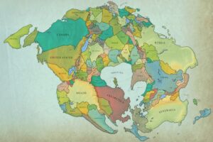
The map above divides the world into 804 roughly equal areas of population with 10 million people each. Here’s a bit more about the project:
Method: population data is from https://citypopulation.de/, or directly from censuses. In cases where the last census is many years ago, i adjust the population of each subdivision by UN estimates for the growth rate of the national population, assuming that that growth happens uniformly. i aimed for an accuracy of ±10%.
Q: How did you choose the region names?
A: if it lined up well with an existing administrative division, i used that. some of the really small regions that are dominated by a city just use the city name.
for the rest, i tried finding some geographic or cultural or historical feature that represented the region. there are quite a few river names.
it’s all pretty subjective! and of course i’m not an expert on everywhere. if you think any are unfitting/inaccurate i’d love to hear about it.
Here are some close-up of the images of various bits of the map:


To zoom in on various bits of the map use this link.
What’s you’re favourite region?
Personally, I’m glad London is more or less till intact and that it now borders Holland en Kent. Also good to see the Celtic Union of Ireland & Wales.


Leave a Reply