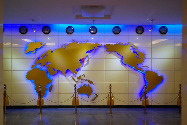
The photo above, allegedly shows a North Korean (Democratic People’s Republic of Korea; DPRK) world map.
It takes several cartographical liberties, most notably showing the entire Korean peninsula as a single unified country.
Other interesting aspects of the include:
- It doesn’t seem to use a standard or consistent map projection.
- It omits the Caspian Sea but does include the Great Lakes.
- The Suez Canal looks massive at the expense of the Sinai.
- Florida and Italy both look much thinner than they are in reality.
- Newfoundland is missing.
- But at least it includes New Zealand!
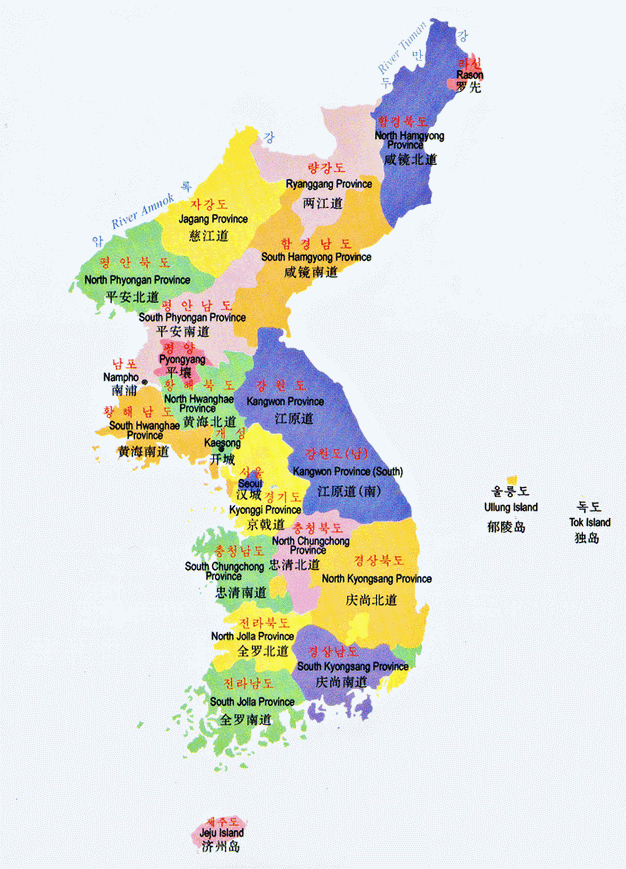
However, it should be noted that both the Democratic People’s Republic of Korea (North Korea) and the Republic of Korea (South Korea) claim the entire peninsula as these two official maps show:

To learn more about North Korea have a look at the following books:
- Nothing to Envy: Ordinary Lives in North Korea
- North Korea Confidential: Private Markets, Fashion Trends, Prison Camps, Dissenters and Defectors
- Without You, There Is No Us: My Time with the Sons of North Korea’s Elite
- North Korea’s Juche Myth
- Escape from Camp 14: One Man’s Remarkable Odyssey from North Korea to Freedom in the West
Find these maps interesting? Then please help spread the word:




Rocio de la CANAL says
El caso de éste planisferio, es interesante ya que podemos contraponer el tradicional mapa mercator con este observando que al estar ubicado en el centro el océano pacífico, se le otorgaría más visibilidad a las porciones territoriales que hayamos en el este y el oeste en la poryeccción antes mencionada en este caso centralizada. la cuestión del poder del mapa es absolutamente interesante ya que “impone” un posicionamiento diferente que invita a pensar el mapamundi de forma diferentes y posicionando la hegemon´pia en este caso grafica en países que de cierta forma quedan “subvalorados” en el planisferio que tradicionalmente usamos. Es necaserio discutir acerca de la aprehendión de esta nueva imagen, es sabido que los países que han intentado implantar en su educación mapas con una visual disferente, caso de los Estados Unidos, han fracasado por la adecuación mental si se quiere que trae consigo la proyección mercator. ahora, lo que se plantea como llamativo en el mapa de korea son las omisiones de ciertos cuerpos de agua, y la distorsión de ciertas áreas, que aparecen más reducidas que lo normal, y que ademáas se han tomado liberatdes en la representación de la propia korea que muestra de forma unificada la del norte y la del sur!
EF says
“The Suez Canal looks massive at the expense of the Sinai.”
More precisely, they deleted the State of Israel.