
- Distorted Map Projection: The map is centered around China, and regions have been resized and rearranged to place China at the geographical center. This results in a highly distorted projection where continents like Europe, Africa, and North America are compressed or elongated unnaturally.
- Japan, India and both Koreas are missing: Interesting that these countries no longer seem exisit on this map.
- China’s Exaggerated Size: China is depicted as much larger than it actually is, spanning almost all of Asia and even encroaching into Europe. This is a visual exaggeration likely designed to emphasize China’s centrality and importance.
- North and South America Placement: The Americas are placed far to the east and depicted as smaller than they actually are. They appear much closer to Asia than in reality, with the Pacific Ocean significantly compressed. Moreover, China does not extend into the Americas at all.
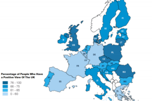
- The UK is now connected to Europe: Nigel Farage’s worst nightmare has come true.
- Incorrect Labels and Misleading Translations: The map is labeled in Chinese, but some translations and region names may be simplified or mislabeled according to a Sinocentric view.
- Australia: Now a tiny island next to New Zealand (which surprisingly is included)
- Taiwan: Now a part of mainland China.
What else do you notice about this map?


sarefo says
this is two maps: a projection of the world maybe taken from google maps or something like that, and a Chinese map on top. you can see Australia under parts of China. the connection of UK is probably sloppy SVG or something.
Satire and Puns says
Now I understand why everyone is worried about what’s going on in the South China Sea…