One of the great things about running Brilliant Maps is the ability to profile brilliant, original map projects.
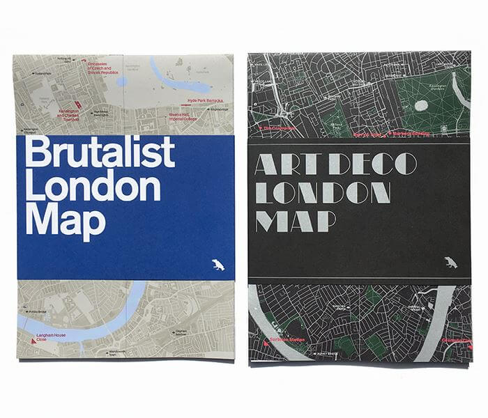
The Art Deco & Brutalist architecture maps of London by Blue Crow Media fall firmly into that category.
Making Sense Of The World, One Map At A Time
One of the great things about running Brilliant Maps is the ability to profile brilliant, original map projects.
The Art Deco & Brutalist architecture maps of London by Blue Crow Media fall firmly into that category.

The map above shows what the Roman City of Londinium (modern day London) might have looked like around 200 AD.

The brilliant isochrone world map above shows how long it takes to get from London to any other point in the world in 2016.
And reimagining of the original isochrone map: Travel Times From London In 1881: The First Known Isochronic Map By Francis Galton
It was created by the team at Rome2rio, who specialise in helping people get anywhere on earth, and is an update to the famous 1914 map by cartographer and geographer John George Bartholomew (see below)

The map shows the Greater London commuter belt, or more specifically the percentage of workers who work in London, but live outside it.

If you’ve never used Map Stack you should. Like right now! It’s a map lover’s dream tool for creating brilliant maps in only a matter of minutes.
You can use it to create really cool maps like the London watercolour map above or the maps of just London’s parks or just London’s water below.

The map above shows the best selling musical acts (band or singer) to come from each of London’s boroughs. The criteria used was as follows:
Smelly Maps: The Digital Life of Urban Smellscapes is the amazing title of this series of maps that look at how London smells. The smelly maps project involves Daniele Quercia, Rossano Schifanella (University of Torino), Luca Maria Aiello (Yahoo Labs) and Kate McLean (Royal College of Art).
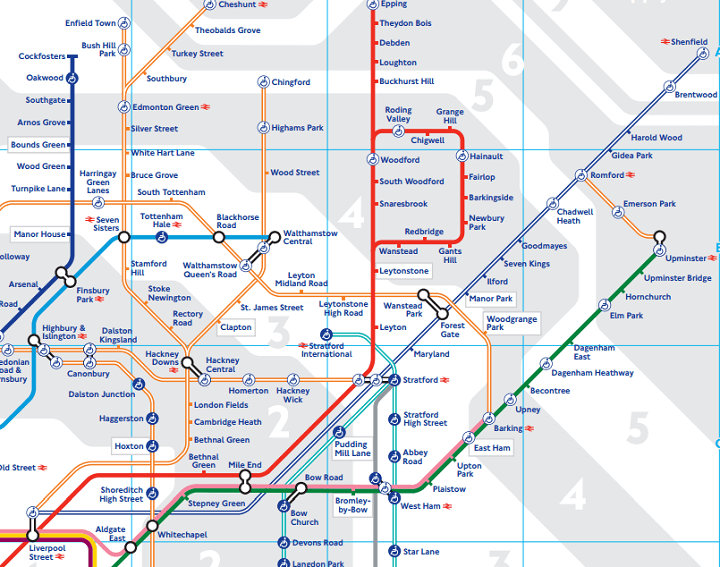
London’s tube map, arguably the most famous transportation map in the world, has just been updated for 2015. The reason is that Transport of London (TFL), which makes the map, has added some new services.
For those not living in London, TFL are the government body responsible for a large part of the transportation system of London. In addition to running London Underground they also run:
Ever think London’s tube map looks confusing? Now imagine trying to use it, but you couldn’t easily distinguish between the colours of each line.
Well for hundreds of thousands of colour blind Londoners, this is their reality each and every day.

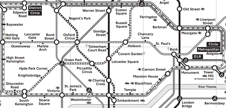
The lack of toilets on the London Underground, is just one of many complaints Londoners have with the network that celebrated it’s sesquicentennial anniversary in 2013.
Looking at the tube map above it’s easy to see why. In zone 1 (central London), only Baker Street (men only), Shoreditch High Street and Hoxton have any toilet facilities within the gateline and none have baby changing facilitates. Only when you get outside of central London do you start finding stations that actually have toilets in them.
Full list: