
Map of New-Netherland & New-Sweden Around 1650

Here’s a little more about each of them:
Map Of The Roads Of The Roman Empire in 200AD

4 Countries Divided By The Cold War

The graphic above shows the maps of 4 countries divided by the Cold War. Two (Germany and Vietnam) have reunified and two (North & South Korea and Romania & Moldova) remain divided.
Here are some facts about each of them:
Map Showing The Range of Neanderthals

In terms of sites:
Map of Operation Unthinkable: A US, British & German Invasion Of The USSR At The End Of WW2

Operation Unthinkable was actually a set of two related contingency plans developed by the British military in 1945 at the end of World War II.
USSR Electrification Map From 1959

Ukraine in particular (smaller map insert) was particularly well covered (more that below).
Propaganda Map Published By The Wehrmacht Depicting The Axis War Against The Soviet Union

Watch World War I In 60 Seconds
The video above was created by one of my favourite Youtubers mapsinanutshell and shows the The First World War from start to finish using Google Earth.
You can also watch the much more detailed version of it below:
The USSR Controlled More Of Europe Than Every Other European Country Put Together

Just the European part of it was larger geographically than every other European country put together.
If you include the Warsaw Pact countries, it controlled 61%! of the European landmass.
And, what’s even more suprising is that the European part of the Soviet Union was only a quarter of the it’s total land area (although did have around 75% of the population).
In terms of numbers, the European part of the USSR was around 5.2 million km2 (2.0 million sq miles), around 1.5 Indias in size.
Western vs Eastern Europe
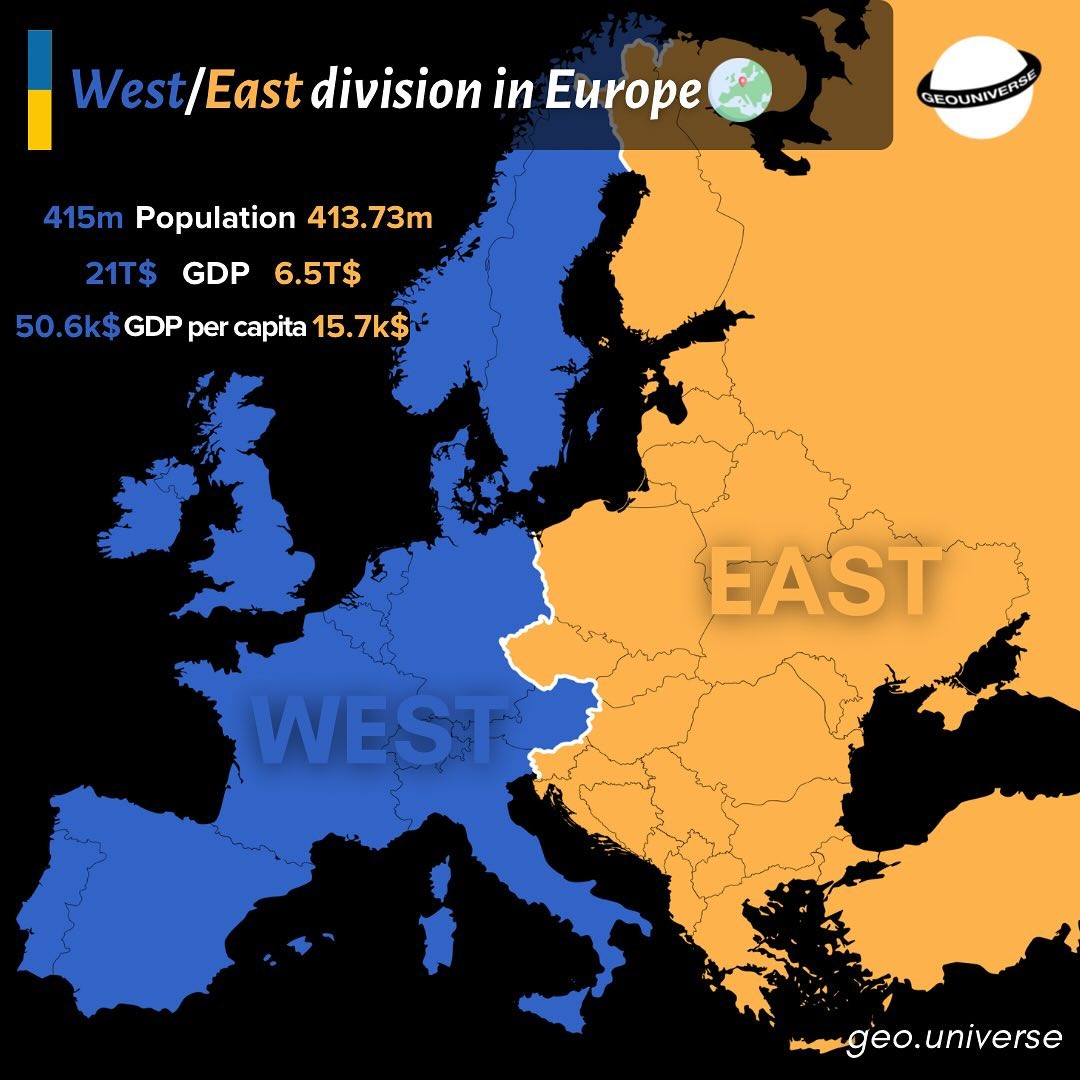
- 415 million vs 413.73 million people
- $21 Trillion vs $6.5 Trillion GDP
- $50,600 vs $15,700 GDP per capita.
What do you think?
- « Previous Page
- 1
- 2
- 3
- 4
- 5
- …
- 9
- Next Page »