
The map above shows the world’s time zones, nothing more, nothing less. It was created by Branden Rishel over at Cartographers without borders, another really awesome map site.
Making Sense Of The World, One Map At A Time
The map above shows the world’s time zones, nothing more, nothing less. It was created by Branden Rishel over at Cartographers without borders, another really awesome map site.

If you live in the English speaking world, you probably take it for granted that you separate decimals from whole numbers using a point. However, you may be surprised to learn that many countries use commas or other decimal marks to separate decimals from whole numbers instead.
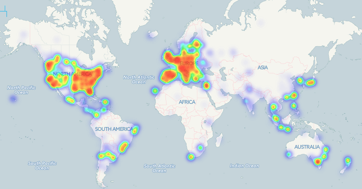
The Bitcoin heat map above shows the locations of 6,683 business where you can use bitcoins to pay. As you can clearly see, businesses are almost exclusively located in Western Europe and the Eastern United States.

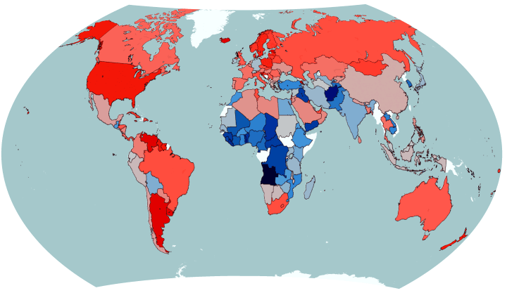
The map above shows one of history’s most astounding global shifts; the drop in fertility rate between 1970 and 2014. The total fertility rate (TFR) is the average number of children born to each woman in a country. It’s important because, it’s an easy way to tell if a country is growing or not, excluding immigration/emigration.
The map above reveals a somewhat shocking fact if you haven’t been paying attention. In the majority of the world’s countries (including virtually all of the richest) women, not men, stay in education longer.

The map above reveals a rather shocking aspect of the First World War. While most people in Western Europe and North America focus on the trench warfare in Northern France and Belgium, it shows that Western European countries were nowhere close to suffering the worst casualty rates in the war.
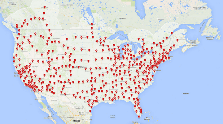
Tesla Motors has quietly been creating a giant network of Supercharger stations that can quickly extend the range of their best selling Model S electric car. Here are a few maps showing how big that network could grow to by the end of next year.

The map above shows which religion is the fastest growing in each country around the world based on data from Pew Research Center’s The Future of World Religions: Population Growth Projections, 2010-2050.
The colours are as follows:
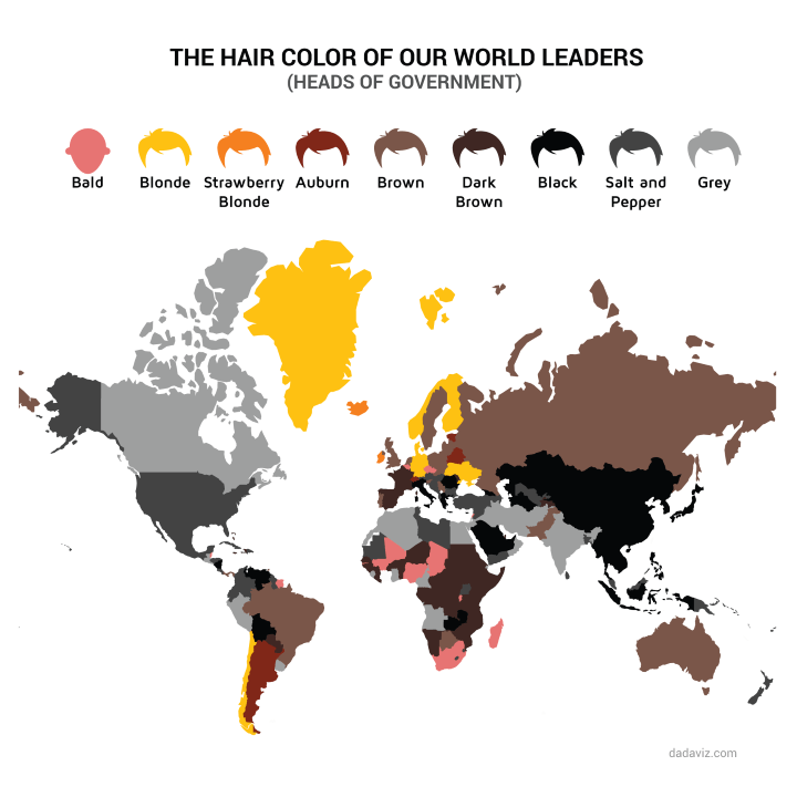
The map above created by @JodySieradzki For @dadaviz shows the hair colour of world leaders. And just to be clear this means heads of government (e.g. Prime Minsters or the US President) and not Heads of State (e.g. Queen Elizabeth II or Presidents in many other countries).
A few interesting things to note:

The map above shows all countries that have sent animals into space based on data from Wikipedia. There are quite a few surprising countries both on and off the list.
Animals include everything from fruit flies to monkeys. Reddit user walkalong compiled the complete list by country: