
The data comes from the Encyclopaedia Metallum for 2023.
Making Sense Of The World, One Map At A Time
The data comes from the Encyclopaedia Metallum for 2023.

The map above shows which has more searches Tesla or the Ford F-150.
It’s based on Google Trends data for the last 12 months.
Now, you may think it’s a bit unfair to compare searches for all of Tesla’s cars with searches for just the F-150, and you’d be right.
However, the sales figures between them are probably smaller than you might think.

As of 2024, it was estimated that there were over 2 million racoons in the country, but the government is seeking to euthanized them.
Until coming across this map I had no idea that racoons could be found anywhere in Europe, let alone in such big numbers.
So how did they get here?

The map above shows the 296 largest Soviet cities with a population of over 100,000 people in 1989.
The 23 largest with over 1 million people are named on the map.
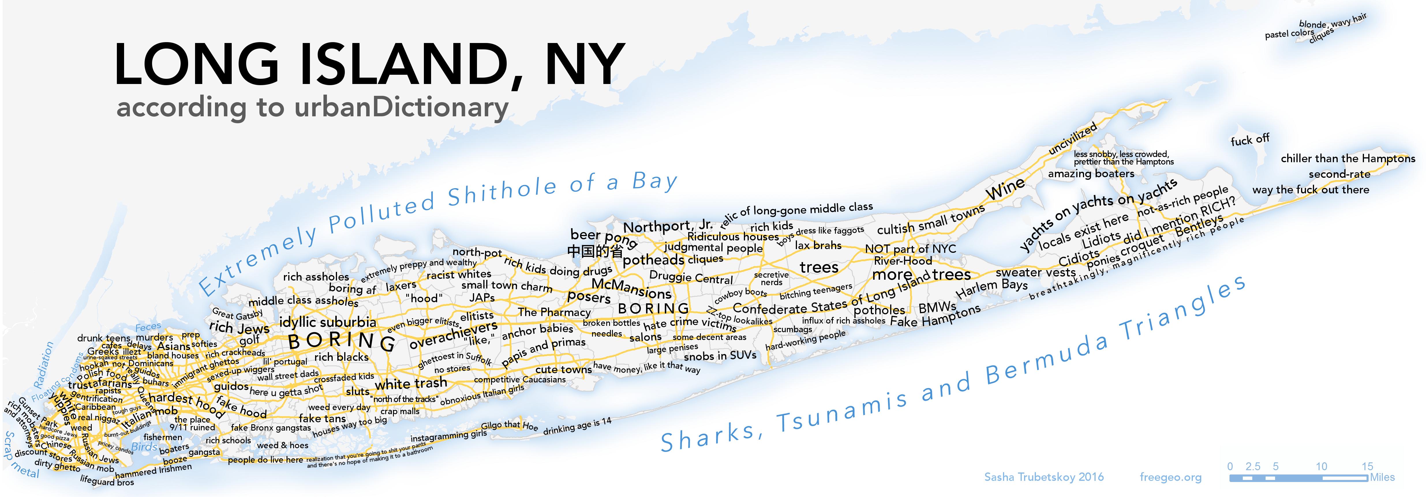
The map above and the one below are both the work of Sasha Trubetskoy, one of my favourite map makers. He explained why made the map:
When I was looking for the Soviet Union’s largest cities, I couldn’t find any good list, let alone a map. Strange, I thought, considering that Russian Wikipedia seems to have incredibly detailed records of every Soviet city’s population.
And yet, nobody had collected them in one place.
I managed to find a report titled Статистика для всех (“Statistics For Everyone”) that summarizes the results of the 1989 Soviet Union Census.
Inside it was a list of cities, which amazingly enough was digitized so I could just copy and paste the data into a spreadsheet.
After some cleaning, some geocoding (God bless Nominatim), and some head-scratching with python’s Basemap, I came up with these maps. The text was added later using Adobe Illustrator, because Matplotlib’s text features are very frustrating.
Below you can see how these cities did in terms of growth and decline up until 2016:
The animated map above shows the breakup of Yugoslavia from 1989 until 2008. You can find out more about the states mentioned in the video below:

The map above looks at whether or not the majority of your country’s population is born in the 20th or 21st centuries as of January 1st, 2025.
The data is based on Median age data from the CIA Worldfact book.
Currently 56 countries & territories have a majority of people born this century, while 173 still have more people born in the 20th century.
You can see the full data, and when a country can expect to become majority born in the 21st century below:
Reddit user LustfulBellyButton, created a super detailed timeline of the various important events in Brazilian history based off the video and maps above:
The video above is Ollie Bye’s amazing tour de force video of The History of the World: Every Year.
As he describes it: “Since 200,000 BCE, humanity has spread around globe and enacted huge change upon the planet. This video shows every year of that story, right from the beginning.”
I had fun playing around with it and sped it up by 18x it’s normal speed so you can watch the whole thing in 60 seconds (see below).
However, if you actually want to see anything you’re better off watching the full version above.

The map above shows the share of bankruptcies in each country that can be traced back to either direct medical costs and/or the costs related to lost income from health related problems.
Here’s more about the sources of the stats for each country: