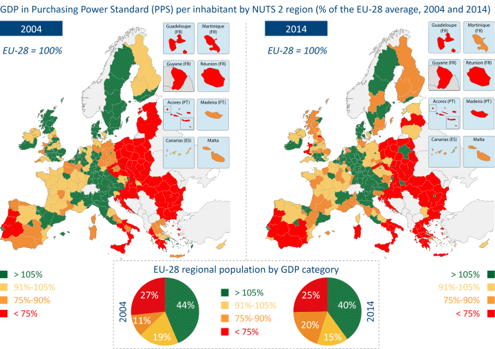
The map above shows the relative GDP per capita of the EU-28’s NUTS 2 Regions in Purchasing Power Standard (PPS) in 2004 and 2014.
And if you’re wondering just what exactly PPS is, Eurostat explains that it:
is an artificial currency unit. Theoretically, one PPS can buy the same amount of goods and services in each country. However, price differences across borders mean that different amounts of national currency units are needed for the same goods and services depending on the country. PPS are derived by dividing any economic aggregate of a country in national currency by its respective purchasing power parities.
Therefore, the map above shows the relative wealth of each region in comparison to the EU-28 average for each year. Those in green have a GDP per capita at least 5% greater than the EU average in that year, whereas those in red have a GDP per capita that is no more than 75% of the EU average.
Inner London (UK) was the EU’s richest region in 2014 with a GDP per capita of 539% of the average.
Severozapaden (Bulgaria) was the poorest with a GDP per capita of just 30% of the EU-28 average.
2004 was choosen as the base year since this is when Cyprus, the Czech Republic, Estonia, Hungary, Latvia, Lithuania, Malta, Poland, Slovakia, and Slovenia all joined the EU. Bulgaria and Romania joined in 2007 and Croatia joined in 2013.
For most of these countries, the economic effects have clearly been positive. Prior to their accession to the EU almost none of these countries had any regions with GDP per capita above the EU average. However, 10 years later that was no longer the case.
On the other hand, Southern Europe most notably Spain and Greece did not fare so well during this period with many of their regions falling to the lowest category.
Overall, economic changes between 2004 and 2014, meant that the EU as a whole become slightly more equal with 40% of people living in the richest regions (compared to 44% in 2014) and only 25% living in the poorest ones (compared to 27% in 2004).
For more have a look at the following books:
- The Political Economy of the European Union
- The Tragedy of the European Union: Disintegration or Revival?
- The Euro: How a Common Currency Threatens the Future of Europe
Find this map interesting? Please help us by sharing it:


Kieran says
How can people complain that we will be worse off outside of the EU. Just look at the state of the UK in the 2014 map compared to the 2004 map. We’re worse of INSIDE the EU, clearly.
Nick says
I don’t see how you can possibly conclude that. This is a relative measure.
You can see which regions have improved their ranking, but for the regions which have not performed as well all that you can say is that some regions have done better.
The exact amount of PPS may well be more in real terms than it was in 2004, just not as much more as for other regions.
Duncan says
No. We’re worse off due to Tory austerity.
Martin Lunnon says
Very noticeable that within countries the capital regions tend to be wealthier than others.