Brilliant Maps

Making Sense Of The World, One Map At A Time

  • BOOK!
  • Newsletter
  • Games & Quizes
  • Map Based Polls
  • Map Tools

What If The US Had The Canadian Electoral System (~100k per district)

Last Updated: April 27, 2026 1 Comment

Click To Get My 10 Best Brilliant Maps For Free:

What If The US Had The Canadian Electoral System (~100k per district)

Map created by reddit user AegeanRepublic

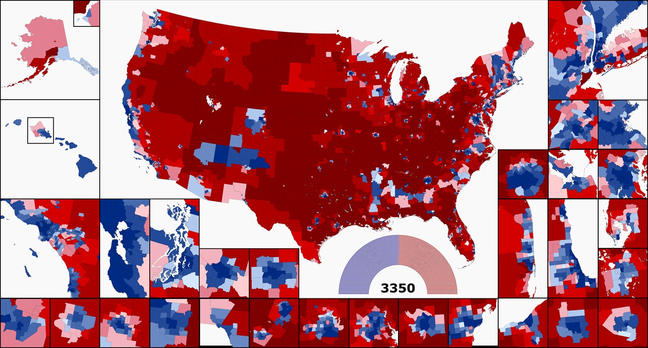
The map above shows what the US House would look like if it had 100k people per district vs the over 750k people per district today.

Overall, you’d have a house with 3,350 members, which in this map would mean 1692 Democrats and 1658 Republicans.

About the inserst:

INSETS (if you have a hard time)

Alaska: Anchorage inset; Hawaii: Honolulu/Oahu inset (easy enough, but I put them here on a technicality)

LEFT, Third row: Los Angeles/San Diego; San Francisco Bay Area; Seattle/Puget Sound; Portland, OR; Minneapolis

RIGHT

New York City

Second row: Philadelphia (and Trenton, NJ), Boston

Third row: Atlanta, Hampton Roads, Washington DC/Baltimore

Fourth row: Miami, Chicago/Milwaukee, (top) Tampa Bay, (bottom) Orlando

BOTTOM ROW: Sacramento; Las Vegas; Phoenix; Denver; El Paso; San Antonio/Austin; Dallas/Fort Worth; Houston; St. Louis; Detroit; Cleveland; Columbus, OH; Pittsburgh

And here a few more 100k maps they’ve made:

Colorado
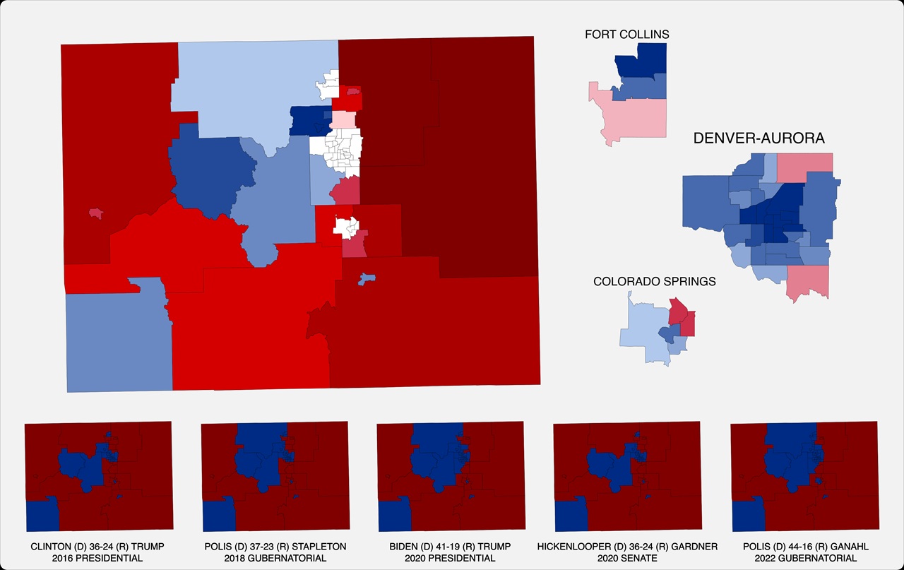
Colorado if it had 100k per house member

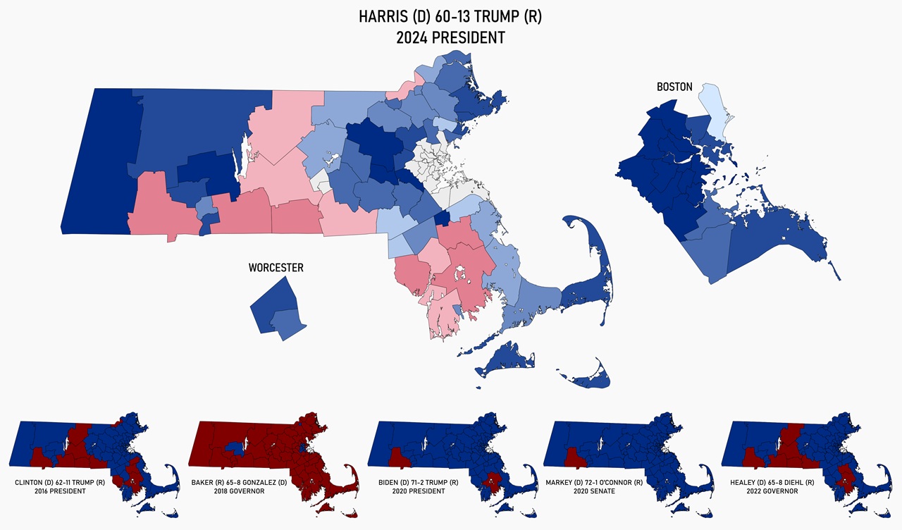
Massachusetts

Massachusetts if it had 100k per house member

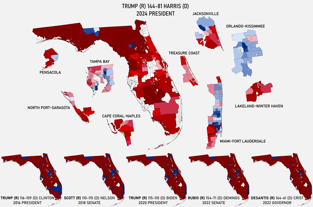
Florida

Florida if it had 100k per house member

Texas

Texas if it had 100k per house member

What do you think?

Filed Under: United States

Click To Get My 10 Best Brilliant Maps For Free:


Other Popular Maps

  • How Far From London Can You Get By Train In 12 Hours

    How Far From London Can You Get By Train In 12 Hours

  • Most Common Country of Origin of New Immigrants To The United States

    Most Common Country of Origin of New Immigrants To The United States

  • Controversial Cultural North-South Divide Map of England & Wales

    Controversial Cultural North-South Divide Map of England & Wales

  • The World According to Ronald Reagan In 1987

    The World According to Ronald Reagan In 1987

  • The Smallest Possible Circles Containing 0.1%-100.0% Of The World’s Population

    The Smallest Possible Circles Containing 0.1%-100.0% Of The World’s Population

  • Russia vs European Economy: Nominal & PPP GDP In 2025

    Russia vs European Economy: Nominal & PPP GDP In 2025

  • Map of American Civil War Battles By Year & Theater

    Map of American Civil War Battles By Year & Theater

  • More People Live In The Blue Dot Than The Red Pentagon

    More People Live In The Blue Dot Than The Red Pentagon

Comments

  1. Graham Creasey says

    May 8, 2026 at 2:17 pm

    Could the map comparing US elections with Canada be re-done with 750k people per district which would be more realistic and manageable for the US House of Representatives?

    Reply

Leave a Reply Cancel reply

Your email address will not be published. Required fields are marked *

This site uses Akismet to reduce spam. Learn how your comment data is processed.


Product Reviews · World Atlas · Map Posters · Settlers of Catan · Risk · Game of Thrones · Coloring Books · Globes · Monopoly · Star Wars · Game of Life · Pandemic · Ticket To Ride · Drinks Cabinets
Size Comparisons · US Locations · Flight Maps · Fleet Management
Copyright © 2026 · Privacy Policy · Fair Use, Attribution & Copyright · Contact Us
Follow Us: Newsletter · Facebook · Youtube · Twitter · Threads · BlueSky · LinkedIn · Instagram · Pinterest · Flipboard