Brilliant Maps

Making Sense Of The World, One Map At A Time

  • BOOK!
  • Newsletter
  • Board Games
  • Posters
  • Scratch Maps

The Shade of Red Each Country Has On Its Flag

Last Updated: March 3, 2023 2 Comments

Click To Get My 10 Best Brilliant Maps For Free:

Shade of red on each country's flag

Map by reddit user xyuksr

The map above simply shows the shade of red that appears on each country’s flag, assuming of course it has red on it. The data comes from here, which shows that 148 out of 192 countries (77%) have some red in their flags.

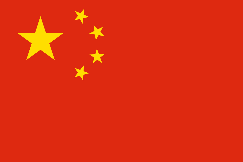
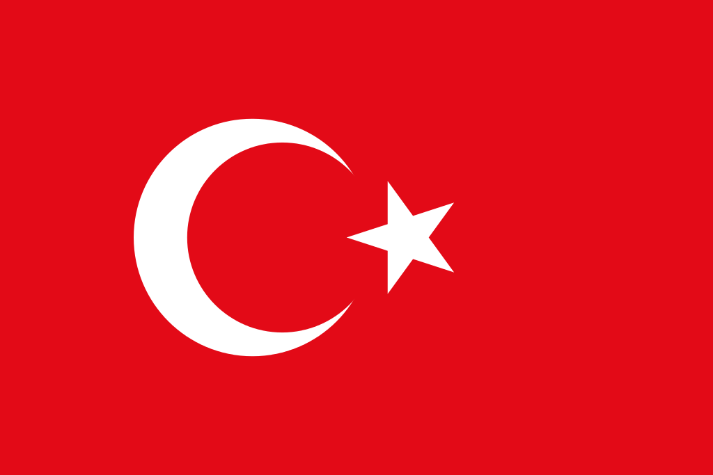
The reddest flags are:

Flag of the People's Republic of China

China (97.63% red), flag source

Flag of Morocco

Morocco (97.62% red), flag source

Flag of Turkey

Turkey (93.9% red), flag source

A few more random facts for you:

  • If the Soviet Union were still around today, its flag would be the reddest at 98%.
  • On average, red takes up around 30% of the space on flags that have red as a colour.
  • While the red in Australia’s flag comes from the United Kingdom’s Union Jack, they use a brighter shade of red in their version.

Want to learn more about flags? Then have a look at:

  • Flags of the World
  • Complete Flags of the World
  • U.S. Nylon US Flag 3X5 ft- Embroidered Stars

How do you feel about red flags? Let us know in the comment section below:

Filed Under: World Maps Tagged With: flags

Click To Get My 10 Best Brilliant Maps For Free:


Other Popular Maps

  • 7 Maps Comparing US GDP In 1820 vs 2025

    7 Maps Comparing US GDP In 1820 vs 2025

  • UK Regions Compared to US States With Similar Population

    UK Regions Compared to US States With Similar Population

  • Map Showing The Number Of Active-Duty US Troops Serving Overseas

    Map Showing The Number Of Active-Duty US Troops Serving Overseas

  • 16 Best Maps of 2016

    16 Best Maps of 2016

  • Map of Israel & Palestine’s Territorial Changes 1920-2008

    Map of Israel & Palestine’s Territorial Changes 1920-2008

  • Map of World War 2 Shipwrecks

    Map of World War 2 Shipwrecks

  • World Map Only Showing Airline Flight Routes

    World Map Only Showing Airline Flight Routes

  • Population Change In Europe vs Arab World 1990-2022

    Population Change In Europe vs Arab World 1990-2022

Comments

  1. Lawrence says

    April 10, 2023 at 4:17 am

    Pbrobably seeing the colour more often somewhere else with other associations can invoke a different response and or feeling.

    Reply
    • Matthieu Palleros says

      December 25, 2023 at 8:40 am

      Hungry for fast food?

      Reply

Leave a Reply Cancel reply

Your email address will not be published. Required fields are marked *

This site uses Akismet to reduce spam. Learn how your comment data is processed.


Product Reviews · World Atlas · Settlers of Catan · Risk · Game of Thrones · Coloring Books
Globes · Monopoly · Star Wars · Game of Life · Pandemic · Ticket To Ride · Drinks Cabinets
US Locations · UK Locations· Fleet Management
Copyright © 2026 · Privacy Policy · Fair Use, Attribution & Copyright · Contact Us
Follow Us: Newsletter · Facebook · Youtube · Twitter · Threads · BlueSky · LinkedIn · Instagram · Pinterest · Flipboard