
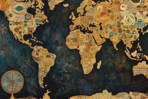
The map above comes from Mark Ovenden’s brilliant book: Transit Maps of the World: Expanded and Updated Edition of the World’s First Collection of Every Urban Train Map on Earth.
And it shows the world connected via London tube style transit map.
As someone who grew up in Ottawa but now lives in London, I’m not sure I like the fact I’d have to change trains twice just to travel between them. We only just got our direct flights back!
But on the flip side, one train straight to Australia would be nice.
Also as a big tube nerd I like the fact he’s still going with the old style Tube map showing the East London Line. It’s the line shown here from Hangzhou (the former Shoreditch station) to Singapore and Wellington (standing in for the two New Cross Stations).
For more on how the London Tube has changed have a look at:
- What A Difference In 25 Years: London Tube Map 1999 vs 2024
- What The Tube Map Could Have Looked Like If Proposals From 1946 Had Been Implemented
- Roman Road Tube Map Circa 125 AD
What do you think of his map?


Paul says
This is just begging for an update to use the current Tube map. Overflowing with ideas right now…
Also, I wonder how a city makes the cut for inclusion; population and/or prestige(?)