Brilliant Maps

Making Sense Of The World, One Map At A Time

  • BOOK!
  • Newsletter
  • Board Games
  • Posters
  • Scratch Maps

70% of Canada’s Population Live In The 3 Coloured Areas On The Map

Last Updated: April 28, 2025 Leave a Comment

Click To Get My 10 Best Brilliant Maps For Free:

canada 70 percent

Map created by the.world.in.maps

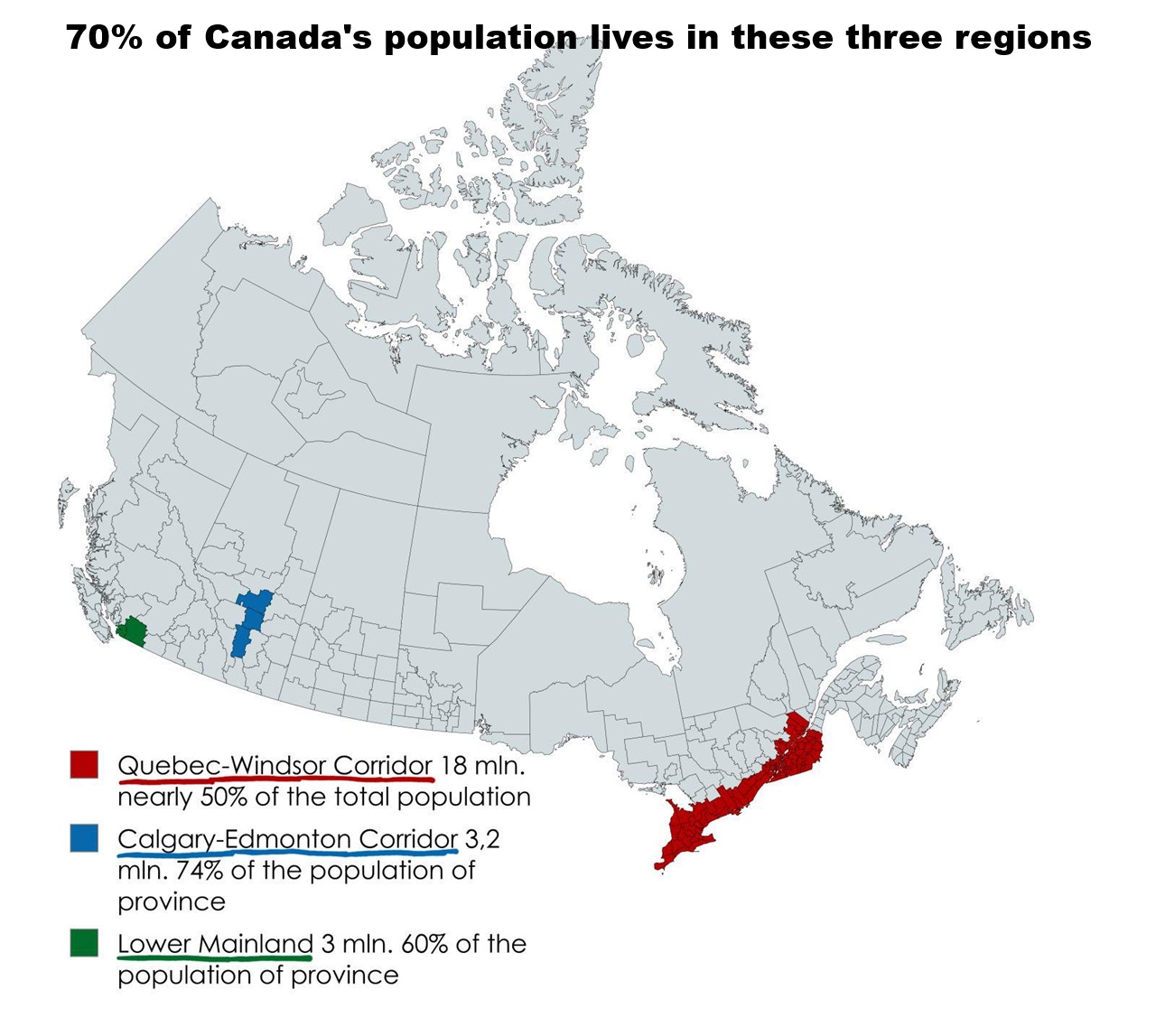
This map highlights how Canada’s population is heavily concentrated in just a few key regions.

Although Canada is the second-largest country in the world by land area, more than 70% of its 40 million residents, or 28 million people live within the coloured zones:

🔴 The Quebec City–Windsor Corridor
Stretching between Toronto, Montreal, and Ottawa, this region alone accounts for over 55% of Canada’s population, with more than 20 million people and seven of Canada’s 12 largest metropolitan areas.

🟢 Greater Vancouver
Canada’s third biggest city, Greater Vancouver is home to around 2.6 million people — despite its relatively small footprint on the map. It contains around 6-7% of Canada’s population.

🔵 The Calgary–Edmonton Corridor
Alberta’s primary population belt, this corridor houses over 3 million people, representing roughly 7–8% of the country’s total population.

In terms of total area the Quebec City–Windsor Corridor covers 230,000 km2 (90,000 sq mi), Greater Vancouver just 2,882.68 km2 (1,113.01 sq mi) and The Calgary-Edmonton Corridor is 38,323.18 km2 (14,796.66 sq mi).

This means in total all 3 areas cover a combined 271,206 km2 (105,910 sq mi) which sounds like a lot but represents just under 3% of the country’s land area or about the same area as the US state of Colorado (population 6 million).

For similar maps see:

  • 50% of Canadians Live South of The Red Line
  • Canada Divided Into Four Equally Populated Regions

What do you think?

Filed Under: Canada

Click To Get My 10 Best Brilliant Maps For Free:


Other Popular Maps

  • Chlamydia Cases Per 100K People by State & Province

    Chlamydia Cases Per 100K People by State & Province

  • Weird Countries in the “Western Sphere” Map Allegedly Based On A Harvard School of International Relations Report

    Weird Countries in the “Western Sphere” Map Allegedly Based On A Harvard School of International Relations Report

  • Digital Nomad Visas: The 44 Countries Who Offer Them & How Long You Can Stay

    Digital Nomad Visas: The 44 Countries Who Offer Them & How Long You Can Stay

  • Percentage of People In Europe Who Believe The Government is Hiding a Cure to Cancer

    Percentage of People In Europe Who Believe The Government is Hiding a Cure to Cancer

  • If These 3 Counties Did Not Exist, Trump Would Have Beaten Biden In 2020

    If These 3 Counties Did Not Exist, Trump Would Have Beaten Biden In 2020

  • Israel’s Territory Before & After The Six-Day War In 1967

    Israel’s Territory Before & After The Six-Day War In 1967

  • Religious Demographics of Lebanon Map

    Religious Demographics of Lebanon Map

  • Animated Timeline Map Of The Growth & Evolution Of Brazil’s Territory & States

    Animated Timeline Map Of The Growth & Evolution Of Brazil’s Territory & States

Leave a Reply Cancel reply

Your email address will not be published. Required fields are marked *

This site uses Akismet to reduce spam. Learn how your comment data is processed.


Product Reviews · World Atlas · Settlers of Catan · Risk · Game of Thrones · Coloring Books
Globes · Monopoly · Star Wars · Game of Life · Pandemic · Ticket To Ride · Drinks Cabinets
US Locations · UK Locations· Fleet Management
Copyright © 2026 · Privacy Policy · Fair Use, Attribution & Copyright · Contact Us
Follow Us: Newsletter · Facebook · Youtube · Twitter · Threads · BlueSky · LinkedIn · Instagram · Pinterest · Flipboard