
The European Green Belt is the backbone of a pan-European ecological network that runs for 12,500 kilometres from the Barents Sea in the north to the Adriatic and Black seas in the south.
Making Sense Of The World, One Map At A Time
The European Green Belt is the backbone of a pan-European ecological network that runs for 12,500 kilometres from the Barents Sea in the north to the Adriatic and Black seas in the south.

The map above shows a potential 9,125 mile (14,685 km) road trip around the United States that would maintain a constant 70°F (21°C) normal daytime high temperature outside.
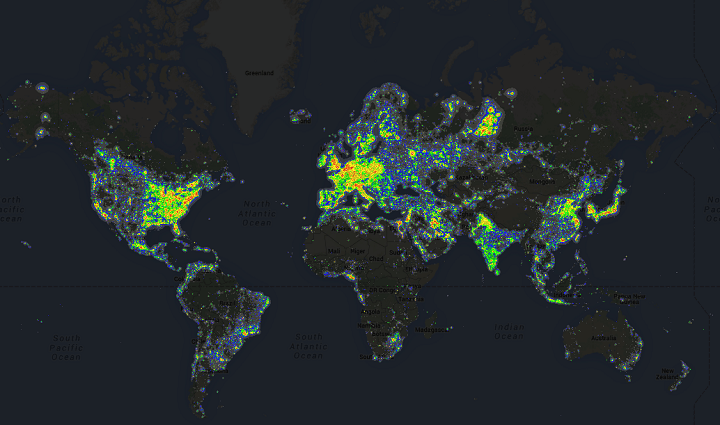
While the map above is now a few years out of date (data from 2006) it shows the amount of light pollution around the world. Not surprisingly, densely populated areas tend to have far more light pollution than sparsely populated ones.
Moreover, wealthy areas tend to have more than poorer ones, which can be clearly seen in some of the more detailed maps below.

As the map above shows, China is home to many of the world’s most polluted cities. The map was created by AQICN, a Chinese website that tracks global air pollution stats.
Ulf Troeng, who told me about the map, clarifies that:
The video above comes from NASA’s Global Modeling and Assimilation Office and shows global aerosol pollution and other particles. And just to be clear, this is aerosol in the scientific sense: