
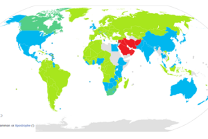
As difficult as it is to believe, the black and blue areas above, each have exactly the same number of people living in the them.
The map was created to highlight the difficulty in reading typical population density maps. While less extreme than Australia or Canada, Europe has is own extreme variations in population density.
London for example has more people living in it than the populations of Scotland and Wales combined.
The map was created in response to this map from Eurostat, which looks like almost no one lives in Spain. In reality many people do, they just happen to be extremely concentrated in a few major cities.
joostjakob goes on to explain that the map is:
Grid of 1 km² each. Black grid cells contain the 10% of the European population who live in the densest areas. Blue grid cells contain the least densely areas with at least 1 inhabitant. Luxembourg is missing because it was missing in the source.
Finally it should be noted that the blue at black areas represent the bottom and top 10% of people respectively. The map should also show grey areas where the remaining 80% of people live, but the resoltuion on the map above is too low.
For more on European cities and population have a look at the following books:
- European Cities and Towns: 400-2000
- The Europeans, Second Edition: A Geography of People, Culture, and Environment
- Good Cities, Better Lives: How Europe Discovered the Lost Art of Urbanism
Enjoy this map? Please help us by sharing it:


Leave a Reply