Brilliant Maps

Making Sense Of The World, One Map At A Time

  • BOOK!
  • Newsletter
  • Board Games
  • Posters
  • Scratch Maps

Visualizing The Population of Various Countries

Last Updated: May 29, 2026 Leave a Comment

Click To Get My 10 Best Brilliant Maps For Free:

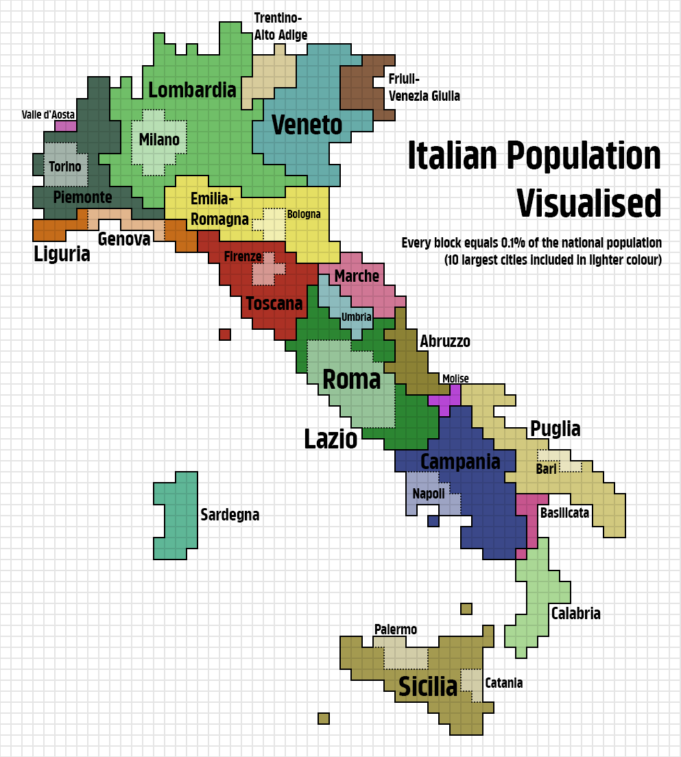
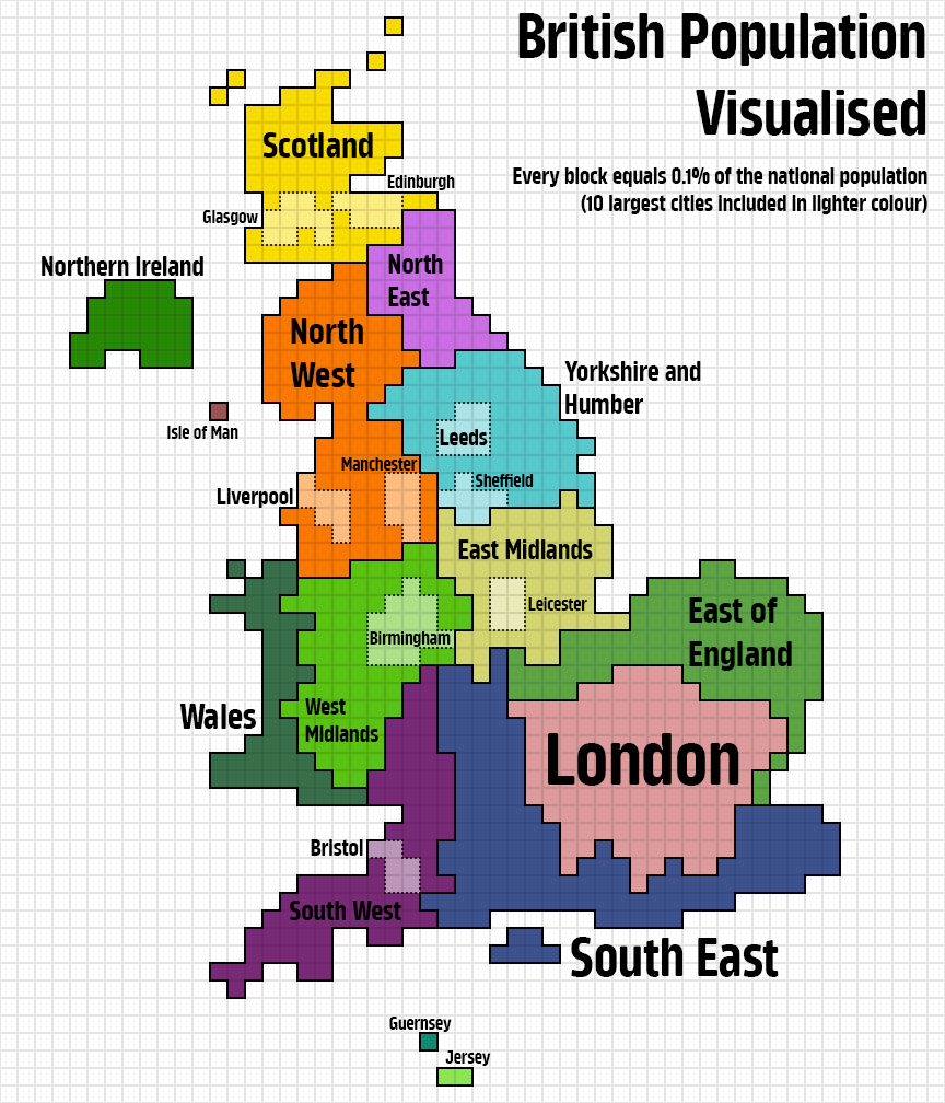
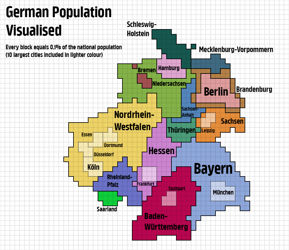
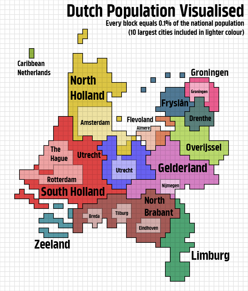
The following maps are all the work of reddit user KaleyTheKing. Each block on each map represents 0.1% of the country’s population.

Let’s have a look:

Australia
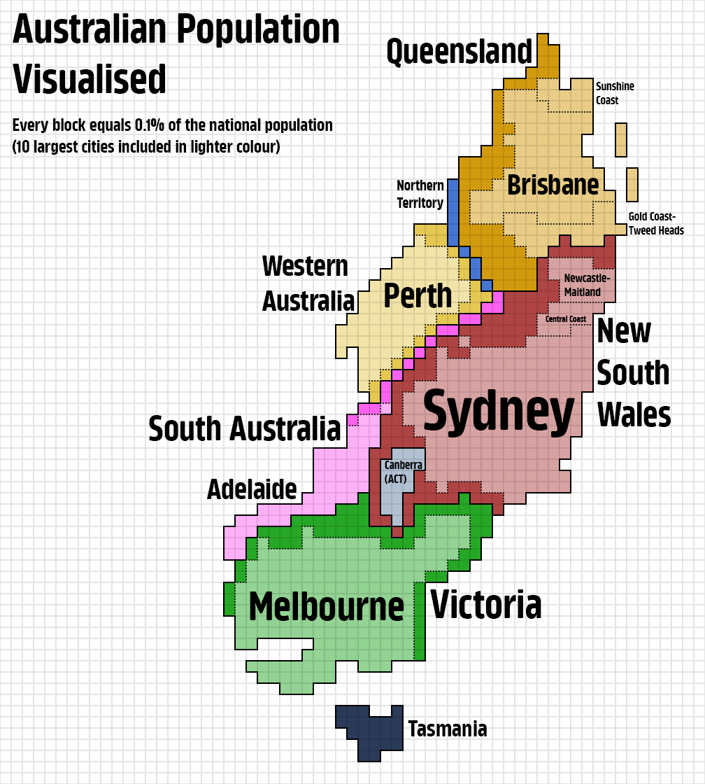
Population of Australia Visualized

Italy

Population of Italy Visualized

UK

Population of The UK Visualized

Germany

Population of Germany Visualized

The Netherlands

Population of The Netherlands Visualized

Japan

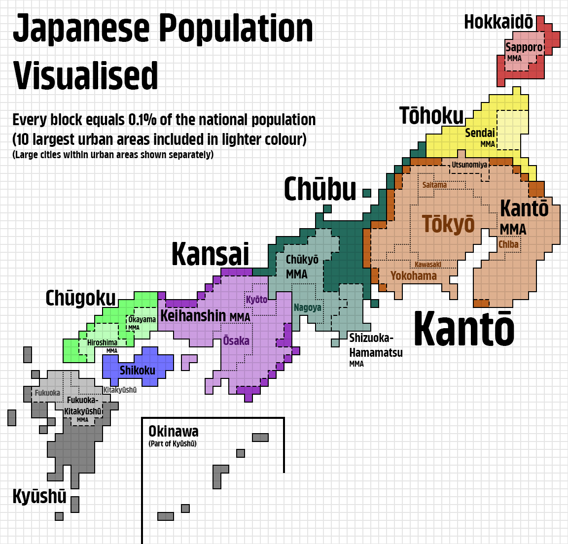
Population of Japan Visualized

Note: “I did something a little differently for this one, I included both the larger metropolitan areas in black, as well as some of their larger constituent cities in the colour of that region. Hope this is a nice compromise solution that people will enjoy.”

Sweden
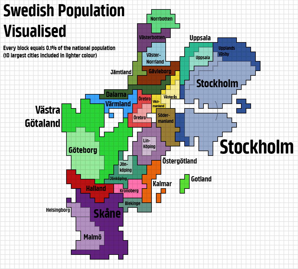
Population of Sweden Visualized

And this maps inspired many other people to create their own versions.

Spain
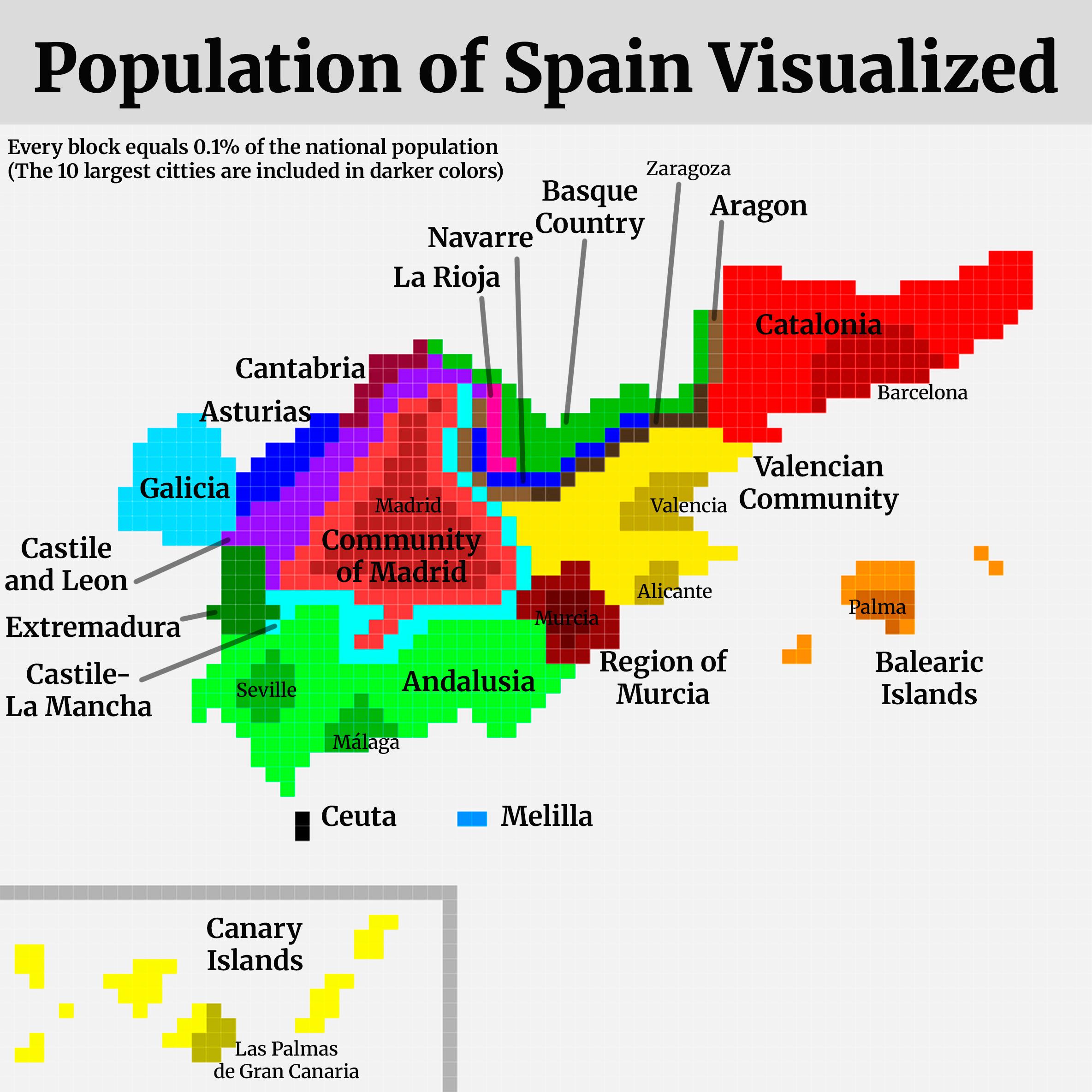
Population of Spain Visualized

u/SafeImpressive4413

Croatia

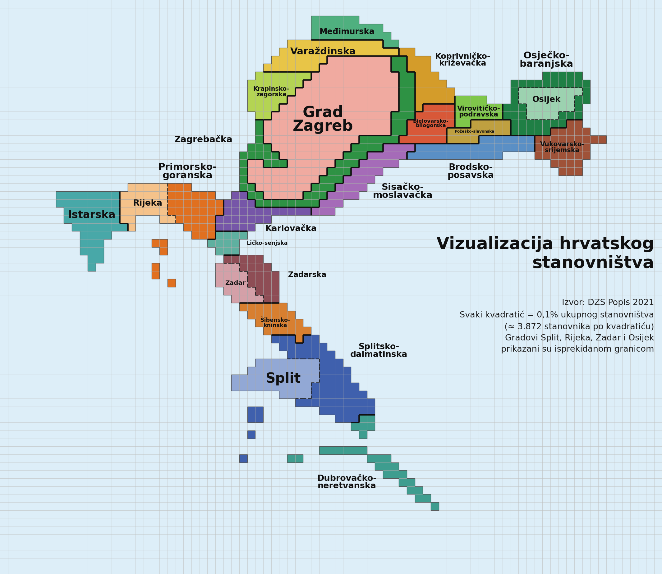
Population of Croatia Visualized

Credit u/loyk1053

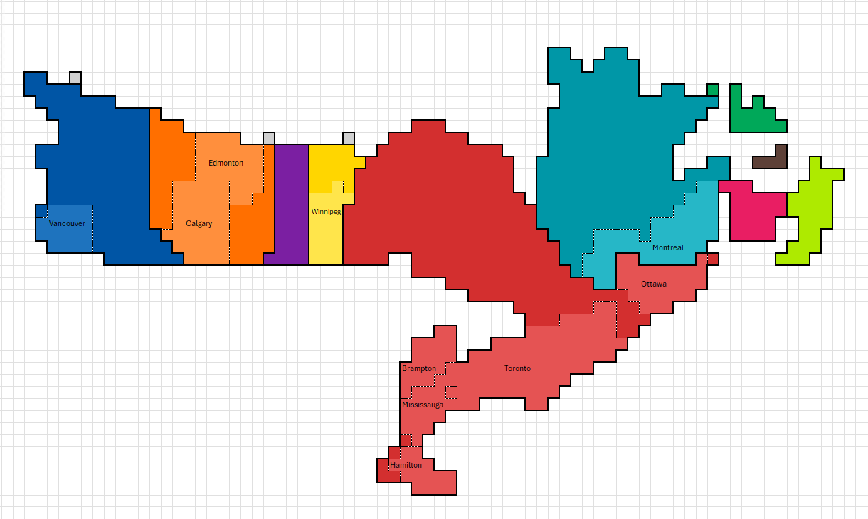
Canada

Population of Canada Visualized

Credit u/Donuil23

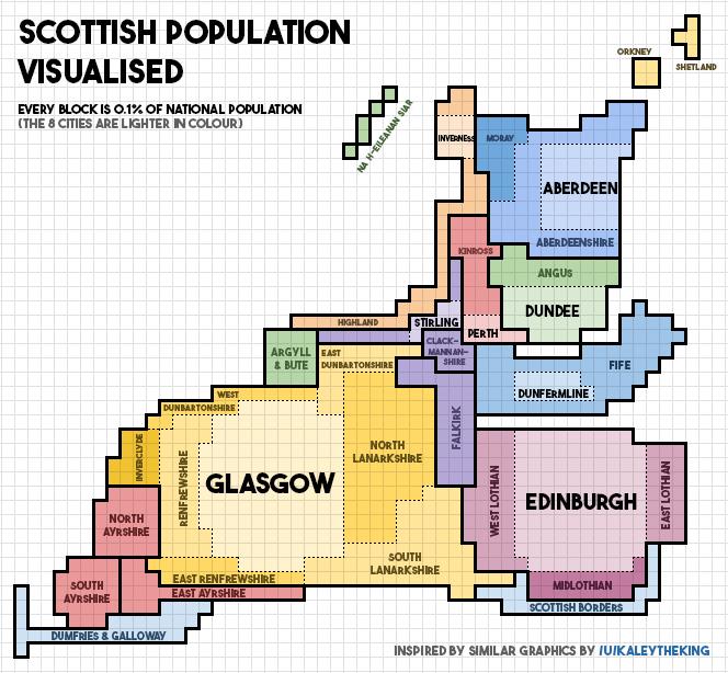
Scotland

Population of Scotland Visualized

Credit u/AidanSmeaton

Which one is your favourite?

Filed Under: World Maps

Click To Get My 10 Best Brilliant Maps For Free:


Other Popular Maps

  • Map Showing Where Rats Live In The World

    Map Showing Where Rats Live In The World

  • Chances of Being Born On Each Continent In 2026

    Chances of Being Born On Each Continent In 2026

  • The Lost Jewish Communities Of The Arab World

    The Lost Jewish Communities Of The Arab World

  • Oregon Counties That Voted to Leave And Join Idaho (2020 – 2024)

    Oregon Counties That Voted to Leave And Join Idaho (2020 – 2024)

  • All Countries That Have Ongoing Territorial Disputes With Others

    All Countries That Have Ongoing Territorial Disputes With Others

  • Italian Satirical Map Of Europe In 1871

    Italian Satirical Map Of Europe In 1871

  • Countries That Have Won Fewer Olympic Medals Than East Germany

    Countries That Have Won Fewer Olympic Medals Than East Germany

  • Map Showing The Range Of Israel’s Jericho III Nuclear Missiles

    Map Showing The Range Of Israel’s Jericho III Nuclear Missiles

Leave a Reply Cancel reply

Your email address will not be published. Required fields are marked *

This site uses Akismet to reduce spam. Learn how your comment data is processed.


Product Reviews · World Atlas · Settlers of Catan · Risk · Game of Thrones · Coloring Books
Globes · Monopoly · Star Wars · Game of Life · Pandemic · Ticket To Ride · Drinks Cabinets
US Locations · UK Locations· Fleet Management
Copyright © 2026 · Privacy Policy · Fair Use, Attribution & Copyright · Contact Us
Follow Us: Newsletter · Facebook · Youtube · Twitter · Threads · BlueSky · LinkedIn · Instagram · Pinterest · Flipboard