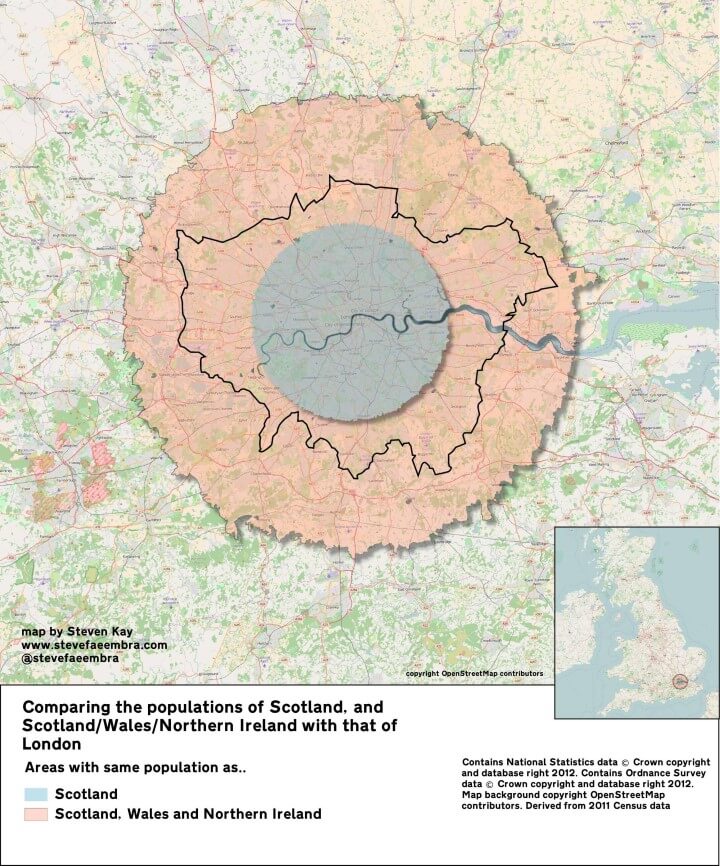
The map above shows just how many people live in London. The blue area above has the same population as Scotland, 5.3 million people.
And the pink area contains the same population as Scotland, Wales and Northern Ireland combined, a little over 10 million people.
You can see how the two areas compare to the population of Greater London (black outline).
The data comes from the 2011 UK census, at which point London’s population was 8,173,941 people. However, current estimates from mid-2015 put London’s population at over 8.6 million people, more than 500,000 more than 2011.
In comparison, Scotland’s population during the same time period is estimated to only have increased by around 60,000 people.
Overall, Scotland’s population would stretch around halfway to the M25, if everyone was plonked in central London.
The pink area appears much bigger, despite only having around twice the number of people as the blue area, because London’s population density decreases as you move out from the centre.
This means the combined population of Scotland, Wales and Northern Ireland would extend just beyond the M25.
To learn more about how this map was made have a look at Steven Kay’s Flickr page.
If you liked the map above, you also be interested in the following books:
- London: The Information Capital: 100 Maps and Graphics That Will Change How You View the City
- This is London: Life and Death in the World City
- To the Ends of the Earth: Scotland’s Global Diaspora, 1750-2010
- A Short History of Scotland
If you enjoyed this post please share it with a friend:


Daniel says
time for a new united Celtic nation including the above and the Republic of Ireland, Isle of Man, Brittany, Cornwall and Asturias.
John says
Thanks for posting this, it backs up my frustration with Scotland having anything more than a few seconds on the national weather forecasts. Yes, it’s cold, windy and wet, who cares? Let’s get a more detailed forecast for places where people live.
RKAY says
John, you’re watching the national (UK) news therefore it divides the time spent on weather forecasts by population – as it does news content. I’m in Scotland it seems the UK news doesn’t give us a lot of attention. Rather than getting down about it I simply watch the easily available Scottish news. You should try it – and it’s not cold, windy and wet today.