
Y-DNA, or Y-chromosomal DNA, is inherited paternally and can provide insights into male lineage and ancestry.
Key points about the map:
Making Sense Of The World, One Map At A Time
Y-DNA, or Y-chromosomal DNA, is inherited paternally and can provide insights into male lineage and ancestry.
Key points about the map:

The map above highlighting the locations lighthouses around the islands of Great Britain and Ireland. The lighthouses are represented by small points of light, giving the impression of stars dotting the coastlines.
The map effectively uses a dark background to contrast with the illuminated points, emphasizing the network of lighthouses surrounding the islands.
Click here to see the rest for other countries.
What do you think?

The 7 maps here show how people in the UK and Ireland refer to their mothers. From Mum to Mom and everything in between. Full credit to Star Key comics for creating all of them.
The map above is the companion to England’s North/South Divide Based Only On Population, expect this time splitting the England and Wales East/West rather than North/South based on 2021 census numbers on official county borders.
The map above show’s England’s North South divide based solely on where 50% of the population live based on the 2021 census using official county border.
The blue areas has 50.25% of the population or 28.3 million people and the red areas have 49.75% of the population or 28.1 million people.

The map above shows the largest self-reported national identity group by share of population for each local authority area of the United Kingdom in the 2011 Census.
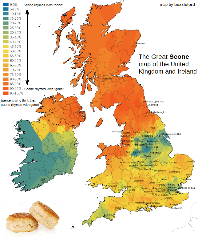
How do you pronounce the word scone?
If you live in Scotland you almost certainly pronounce it in a way that rhymes with “gone”, whereas if you live in Ireland you’re far more likely to pronounce it so it rhymes with “cone.” And in England and Wales, well let’s just say it’s complicated.
The map above shows the best selling singer, musical artist or band from each of England’s 48 ceremonial counties. The criteria seems to be where someone has grown up rather than necessarily where they were born.

The map above shows the regional breakdown of which sauce, topping or condiment is the most popular for chip shop chips in the UK. The results are based on a reddit poll taken between 10-12 February 2018, which resulted in a total of 670 accepted responses.
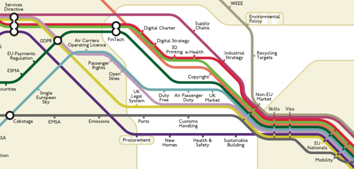
These tube-style Brexit maps are a clever way of visualising the myriad of sectors and issues the withdrawal process impacts. Just by looking at the maps, it becomes easier to understand the scope and scale of the negative consequences facing the UK.
Each map focuses on a UK region, with each each zone representing a policy sphere, each line representing a sector and each station representing a particular Brexit issue.