Brilliant Maps

Making Sense Of The World, One Map At A Time

  • BOOK!
  • Newsletter
  • Board Games
  • Posters
  • Scratch Maps

Harris, Biden and Clinton’s Voter Archipelagos

Last Updated: January 16, 2025 1 Comment

Click To Get My 10 Best Brilliant Maps For Free:

Harris Voter Archipelago

These 3 wonderful maps are all the work of Alex at Vividmaps (you can see an integrative version on his site).

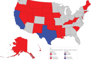
They show the lone islands of voting support for Harris, Biden and Clinton in their respective US Presidential elections against Donald Trump visualised as topography maps rather than standard election maps.

Here are the ones for Biden in 2020 and Clinton in 2016:

Biden Voter Archipelago

Clinton Voter Archipelago

The changes tell quite a story. Several urban areas that stood as islands in 2020 have submerged into the Republican Sea. Other islands got smaller, showing how Harris received less support than Biden did in many metropolitan areas.

Here’s a comparison by the numbers:

ClintonBidenHarris
Total Votes Won65,853,51481,283,50175,019,257
Percentage Of Vote Won48.2%51.3%48.4%
Electoral Votes Won227306226
Total States Won20 + DC25 + DC + NE-0219 + DC + NE-02
Number of Counties Won490538452

The data above suggests that the democrats have an increasingly large problem on their hands.

Harris, despite getting nearly 10 million more votes than Clinton in 2016, and higher vote share, won 38 fewer counties, which shows support for the democrats is getting more and more concentrated in fewer and fewer areas.

You can see more US presidential maps here.

What do you think?

Filed Under: World Maps

Click To Get My 10 Best Brilliant Maps For Free:


Other Popular Maps

  • Canadians Support Of The Idea of Canada Becoming the 51st State

    Canadians Support Of The Idea of Canada Becoming the 51st State

  • Neo-Tokyo (from Akira) vs Real-Life Tokyo In 2019

    Neo-Tokyo (from Akira) vs Real-Life Tokyo In 2019

  • The 15 Countries Richer Than The US In 1980 & How They Are Doing In 2025

    The 15 Countries Richer Than The US In 1980 & How They Are Doing In 2025

  • Map of World in George Orwell’s 1984

    Map of World in George Orwell’s 1984

  • Catalonia & The Catalan Language: 10 Facts & Maps

    Catalonia & The Catalan Language: 10 Facts & Maps

  • 4 Maps That Put China’s & India’s Populations Into Perspective

    4 Maps That Put China’s & India’s Populations Into Perspective

  • How Antarctica Would Look If All The Ice Melted

    How Antarctica Would Look If All The Ice Melted

  • How The US Population Changed In 40 Years From 1982 to 2022

    How The US Population Changed In 40 Years From 1982 to 2022

Comments

  1. Christopher From London says

    January 20, 2025 at 4:22 pm

    Incredible maps. Such a great idea. The archipelago one is great!

    Reply

Leave a Reply Cancel reply

Your email address will not be published. Required fields are marked *

This site uses Akismet to reduce spam. Learn how your comment data is processed.


Product Reviews · World Atlas · Settlers of Catan · Risk · Game of Thrones · Coloring Books
Globes · Monopoly · Star Wars · Game of Life · Pandemic · Ticket To Ride · Drinks Cabinets
US Locations · UK Locations· Fleet Management
Copyright © 2026 · Privacy Policy · Fair Use, Attribution & Copyright · Contact Us
Follow Us: Newsletter · Facebook · Youtube · Twitter · Threads · BlueSky · LinkedIn · Instagram · Pinterest · Flipboard