Most people go through life perfectly happy in the knowledge that the real earth looks like it does on a standard Mercator projection map. Cartographers, map nerds and those that have seen this scene from the West Wing know that this is not really the case.
Wikipedia sums up why map projections are necessary in the first place:
Map projections are necessary for creating maps. All map projections distort the surface in some fashion. Depending on the purpose of the map, some distortions are acceptable and others are not; therefore, different map projections exist in order to preserve some properties of the sphere-like body at the expense of other properties. There is no limit to the number of possible map projections.
The comic above by Randall Munroe at XKCD looks at What your favorite map projections says about you (assuming you have one).
For those that don’t, here’s a basic explanation of each type:
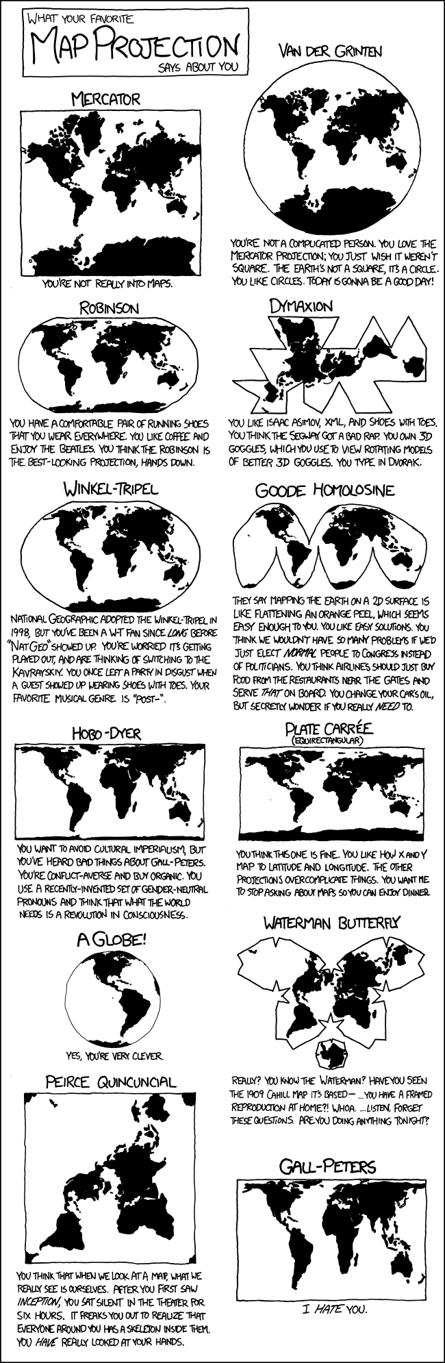
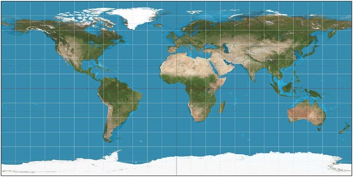
Mercator
What it says about you: You’re not really into maps.
Summary:
The Mercator projection is a cylindrical map projection presented by the Flemish geographer and cartographer Gerardus Mercator in 1569. It became the standard map projection for nautical purposes because of its ability to represent lines of constant course, known as rhumb lines or loxodromes, as straight segments that conserve the angles with the meridians.
Advantages:
The two properties, conformality and straight rhumb lines, make this projection uniquely suited to marine navigation: courses and bearings are measured using wind roses or protractors, and the corresponding directions are easily transferred from point to point, on the map, with the help of a parallel ruler or a pair of navigational protractor triangles.
Disadvantages:
Mercator projection distorts the size of objects as the latitude increases from the Equator to the poles, where the scale becomes infinite. So, for example, Greenland and Antarctica appear much larger relative to land masses near the equator than they actually are.
Source: Mercator projection on Wikipedia.
Buy: Mercator: The Man Who Mapped the Planet
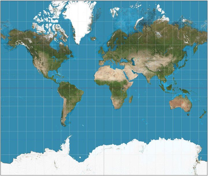
Van der Grinten
What it says about you: You’re not a complicated person. You love the Mercator projection; you just wish it weren’t square. The Earth’s not a square, it’s a circle. You like circles. Today is gonna be a good day!
Summary:
The van der Grinten projection is a compromise map projection that is neither equal-area nor conformal. It projects the entire Earth into a circle, though the polar regions are subject to extreme distortion.
Advantages:
It was made famous when the National Geographic Society adopted it as their reference map of the world from 1922 until 1988.
Disadvantages:
[…] polar regions are subject to extreme distortion… is an arbitrary geometric construction on the plane.
Source: Van der Grinten projection on Wikipedia
Buy: World Satellite Map – Van Der Grinten – Physical Topography
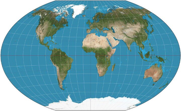
Robinson
What it says about you: You have a comfortable pair of running shoes that you wear everywhere. You like coffee and enjoy The Beatles. You think the Robinson is the best-looking projection, hands down.
Summary:
The Robinson projection is a map projection of a world map which shows the entire world at once. It was specifically created in an attempt to find a good compromise to the problem of readily showing the whole globe as a flat image.
Advantages:
The Robinson projection is neither equal-area nor conformal, abandoning both for a compromise. The creator felt this produced a better overall view than could be achieved by adhering to either. The meridians curve gently, avoiding extremes, but thereby stretch the poles into long lines instead of leaving them as points.
Disadvantages:
[…]distortion close to the poles is severe, but quickly declines to moderate levels moving away from them. The straight parallels imply severe angular distortion at the high latitudes toward the outer edges of the map.
Source: Robinson projection on Wikipedia
Buy: USA Markable Map/World Markable Map (Modified Robinson Projection)
Dymaxion
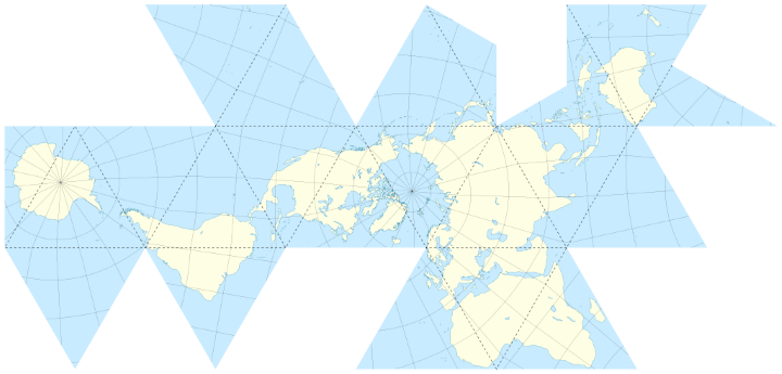
What it says about you: You like Isaac Asimov, XML, and shoes with toes. You think the Segway got a bad rap. You own 3D goggles, which you use to view rotating models of better 3D goggles. You type in Dvorak.
Summary:
The Dymaxion map or Fuller map is a projection of a world map onto the surface of an icosahedron, which can be unfolded and flattened to two dimensions. The flat map is heavily interrupted in order to preserve shapes and sizes.
Advantages:
It has less distortion of relative size of areas, most notably when compared to the Mercator projection; and less distortion of shapes of areas, notably when compared to the Gall–Peters projection. …
More unusually, the Dymaxion map does not have any “right way up”.
Disadvantages:
It is not a gnomonic projection, whereby global data expands from the center point of a tangent facet outward to the edges.
Source: Dymaxion map on Wikipedia
Buy: Fuller Projection Dymaxion Air-ocean World
Winkel tripel
What it says about you: National Geographic adopted the Winkel-Tripel in 1998, but you’ve been a W-T fan since long before “Nat Geo” showed up. You’re worried it’s getting played out, and are thinking of switching to the Kavrayskiy. You once left a party in disgust when a guest showed up wearing shoes with toes. Your favorite musical genre is “Post–”.
Summary:
The Winkel tripel projection (Winkel III), a modified azimuthal map projection of the world… The projection is the arithmetic mean of the equirectangular projection and the Aitoff projection: The name Tripel (German for “triple”) refers to Winkel’s goal of minimizing three kinds of distortion: area, direction, and distance.
Advantages:
[…] the Winkel tripel fares well against several other projections analyzed against their measures of distortion, producing small distance errors, small combinations of Tissot indicatrix ellipticity and area errors, and the smallest skewness of any of the projections.
Disadvantages:
The lines of latitude in Winkel Tripel they are slightly curved and non-parallel.
Also:
The Winkel Tripel projection is not equidistant; there is no point or points from which distances are shown accurately […] The Winkel Tripel projection is not azimuthal; there is no point or points from which directions are shown accurately.
Sources: Winkel tripel projection on Wikipedia and Winkel Tripel Projections
Buy: World Decorator (Laminated National Geographic Reference Map – Winkel Tripel projection)
Goode Homolosine
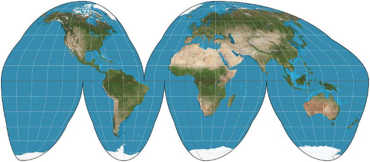
What it says about you: They say mapping the Earth on a 2D surface is like flattening an orange peel, which seems enough to you. You like easy solutions.You think we wouldn’t have so many problems if we’d just elect normal people to Congress instead of Politicians. You think airlines should just buy food from the restaurants near the gates and serve that on board. You change your car’s oil, but secretly wonder if you really need to.
Summary:
The Goode homolosine projection (or interrupted Goode homolosine projection) is a pseudocylindrical, equal-area, composite map projection used for world maps. Normally it is presented with multiple interruptions. Its equal-area property makes it useful for presenting spatial distribution of phenomena.
Advantages:
[…] an alternative to the Mercator projection for portraying global areal relationships. Goode offered variations of the interruption scheme for emphasizing the world’s land masses and the world’s oceans.
Disadvantages:
In its most common form, the map interrupts the North Atlantic, the South Atlantic, the South Pacific, the Indian Ocean, and the entire east/west meridian of the map.
Source: Goode homolosine projection on Wikipedia
Buy: Map of world from Goode’s homolosine projection
Hobo–Dyer
What it says about you: You want to avoid cultural imperialism, but you’ve heard bad things about Gall-Peters. You’re conflict-averse and buy organic. You use a recently-invented set of gender-neutral pronouns and think that what the world needs is a revolution in consciousness.
Summary:
The Hobo–Dyer map projection is a cylindrical equal-area projection, with standard parallels (where there is no north-south nor east-west distortion) at 37.5° north and south of the equator.
Advantages:
The original ODT map is printed on two sides, one side with north upwards and the other, south upwards. This, together with its equal-area presentation, is intended to present a different perspective compared with more common non-equal area, north-up maps.
Disadvantages:
[…] the map stretches the low latitudes vertically less than Peters, but at the price of greater compression near the poles.
Source: Hobo–Dyer projection on Wikipedia
Buy: The Hobo-Dyer equal area projection world map
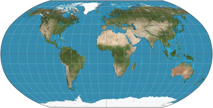
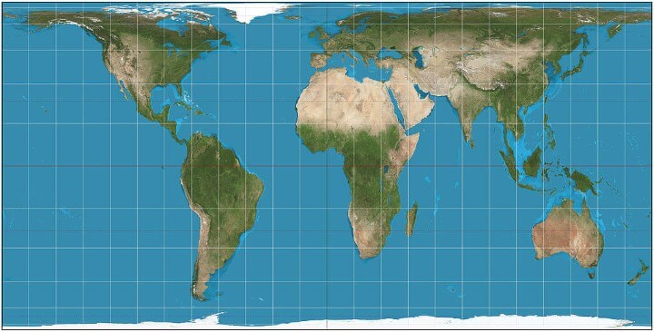
Plate carrée (Equirectangular)
What it says about you: You think this one is fine. You like how X and Y map to latitude and longitude. The other projections overcomplicate things. You want me to stop asking about maps so you can enjoy dinner.
Summary:
The projection maps meridians to vertical straight lines of constant spacing for meridional intervals of constant spacing, and circles of latitude to horizontal straight lines of constant spacing for constant intervals of parallels.
Advantages:
[…] the plate carrée has become a standard for global raster datasets, such as Celestia and NASA World Wind, because of the particularly simple relationship between the position of an image pixel on the map and its corresponding geographic location on Earth.
Disadvantages:
The projection is neither equal area nor conformal. Because of the distortions introduced by this projection, it has little use in navigation or cadastral mapping […]
Sources: Equirectangular projection on Wikipedia
A Globe
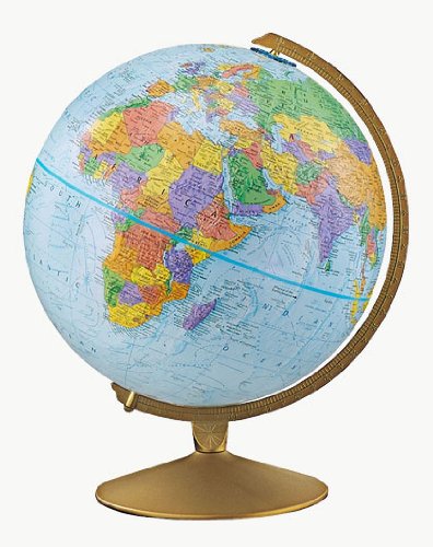
What it says about you: Yes, you’re very clever.
Summary:
A globe is a three-dimensional scale model of Earth.
Advantages:
Same shape as the earth.
Disadvantages:
Can’t hang on a wall.
Buy: Replogle Globes Illuminated Diplomat Globe
Waterman Butterfly
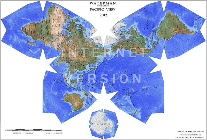
What it says about you: Really? You know the Waterman? Have you seen the 1909 Cahill Map it’s based— …You have a framed reproduction at home?! Whoa. …Listen, forget these questions. Are you doing anything tonight?
Summary:
The arrangement is an unfolding of a globe treated as a truncated octahedron, evoking the butterfly map principle first developed by Bernard J.S. Cahill (1866–1944) in 1909.
– Waterman butterfly projection on Wikipedia
Advantages:
The Waterman projection show the equator clearly, as well as continental shapes, distances (within 10 %), areas (within 10 %) angular distortions (within 20 degrees), and relative postions, as a compromise: statistically better than all other World maps.
Disadvantages:
The North Polar meridians are drawn at conspicuously different longitude-widths, which produce visible stretch-distortion of Ellesmere Island and Greenland.
– Review of Waterman Octahedral World Map
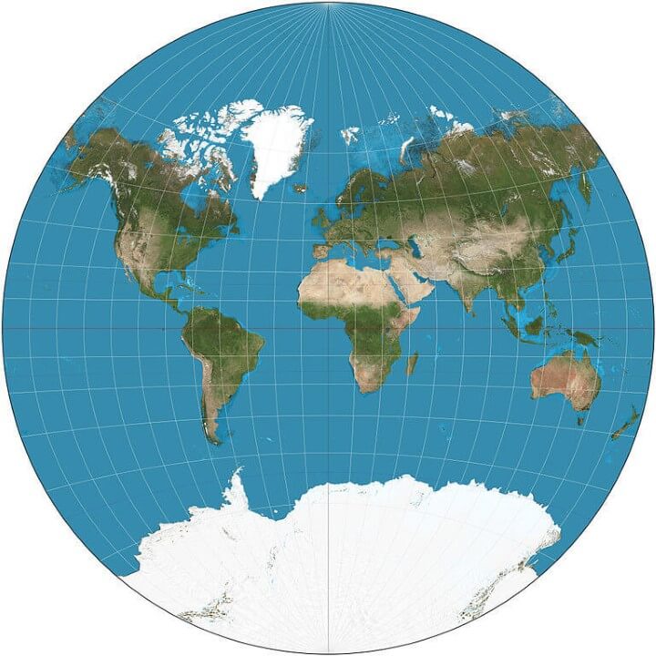
Peirce Quincuncial
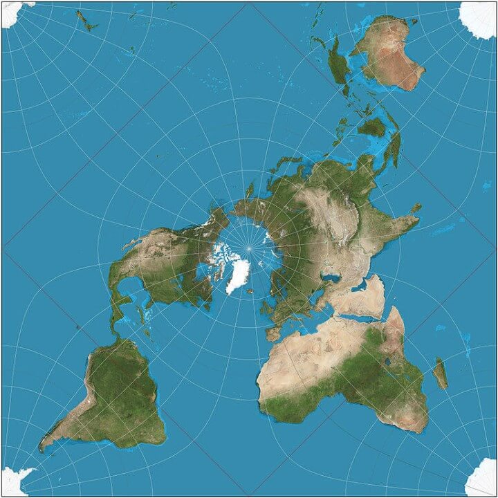
What it says about you: You think that when we look at a map, what we really see is ourselves. After you first saw Inception, you sat silent in the theater for six hours. It freaks you out to realize that everyone around you has a skeleton inside them. You have really looked at your hands.
Summary:
The Peirce quincuncial projection is a conformal map projection developed by Charles Sanders Peirce in 1879.
Advantages:
It has been used recently to present spherical panoramas for practical as well as aesthetic purposes, where it can present the entire sphere with most areas being recognizable.
Disadvantages:
It is conformal everywhere except at the four corners of the inner hemisphere (thus the midpoints of edges of the projection), where the equator and four meridians change direction abruptly (the equator is represented by a square). These are singularities where differentiability fails.
[…]
the Peirce quincuncial has been rarely used for geographic purposes.
Source: Peirce quincuncial projection on Wikipedia
Gall–Peters

What it says about you: I hate you.
Summary:
The Gall–Peters projection, named after James Gall and Arno Peters, is one specialization of a configurable equal-area map projection known as the equal-area cylindric or cylindrical equal-area projection. It achieved considerable notoriety in the late 20th century as the centerpiece of a controversy surrounding the political implications of map design.
Advantages:
On Peters’s projection, […], areas of equal size on the globe are also equally sized on the map.
Disadvantages:
Peters’s chosen projection suffers extreme distortion in the polar regions, as any cylindrical projection must, and its distortion along the equator is considerable. Several scholars have remarked on the irony of the projection’s undistorted presentation of the mid latitudes, including Peters’s native Germany, at the expense of the low latitudes, which host more of the technologically underdeveloped nations.
The claim of distance fidelity is particularly problematic: Peters’s map lacks distance fidelity everywhere except along the 45th parallels north and south, and then only in the direction of those parallels. No world projection is good at preserving distances everywhere; Peters’s and all other cylindric projections are especially bad in that regard because east-west distances inevitably balloon toward the poles.
Source: Gall–Peters projection on Wikipedia
For a further explanation of the comic please see 977: Map Projections on Explain XKCD. For even more map projections see: List of map projections on Wikipedia.
For more from Randall Munroe see:
- xkcd: volume 0
- What If?: Serious Scientific Answers to Absurd Hypothetical Questions
- Thing Explainer: Complicated Stuff in Simple Words
Finally to learn more about map projections in general have a look at:
- Flattening the Earth: Two Thousand Years of Map Projections
- Maps: Their Untold Stories
- Map Projections: A Reference Manual
Have a favourite map projections? Please let us know below:

Brilliant Maps says
So glad to be of help and really happy you enjoy this site.
chlewey says
My favorite is Lambert Azimuthal Equal Area, centered at whatever place you might want. Highly distorted in the antipodes of the chosen center point, but very nice to show things around that point (and how they relate to that point).
Maddie Poll says
This was so helpful for my AP Human Geography class. I was able to get my assignment done so quickly!
Maddison Broyles says
Was the Gall Peters map the same thing as a Peters map?
noobmaster69 says
yes it is
Dave says
Robinson looks nice
Krishna D says
I’m not a complicated person. I love the Mercator projection; I just wish it weren’t square. The Earth’s not a square, it’s a circle. I like circles. Today is gonna be a good day!
Ilsa says
Could you do one of these on the Ekert IV. This site was very helpful and would be more helpful if you had the Ekert IV on this site.
Matt says
My fave is the “Borneo Skew-orthomorphic Rectified” projection. When I studied geodesy in the early 1990’s this was one of the less common projections we learned about 🙂
Professionally, UTM or other TM projections are those that I use the most.
Michael Ossipoff says
Peters distorts the equator. Flatter Cylindrical Equal Area maps like Behrmann flatten the high latitudes more.
Behrmann is like Peters, but not as big in the North-South dimension. Africa doesn’t look so bad in Behrmann. …but the high-latitude places are more squashed.
So, Peters is better for high-lat, and Behrmann is better for low-lat. So combine both of them in a stacked-configuration, with the Behrmann map showing all the Earth, and the Peters map only showing the high-lat places that are squashed in Behrmann.
The Peters map would be placed directly on top of the Behrmann map. Both would have the same width.
But, better yet, substitute Square-Tobler Cylindrical Equal-Area for Peters. Tobler is like Peters, but the map is square. Because the map is so tall North-South, it distorts the tropics even more, but it squashes high-lat places a lot less.
As I said, the Behrmann map shows the whole Earth. The Tobler map shows everything from lat 41.41 on up tot the pole. Lat 41.41 is where the north-south scale in Behrmann is just the same as the equatorial scale. So, to show places squashed north-south in Behrmann, the Tobler map shows the world from lat 41.41 on up.
Thereby, you avoid the great equatorial distortion of Peters, and (in the upper, Tobler map) the high-lat squashing of most Cylindrical-Equal-Area maps.
In the upper, Tobler section, at the northernmost place in Norway’s arctic coast has a north-south scale as large as the equatorial scale. In other words, with this stacked combination, minimum-scale is at least as great as the equatorial-scale, all the way up to Norway’s arctic coast.
In the Tobler part, not squashed high-lat. In the Behrmann part, no highly-distorted Africa. This stacked combination avoids both shortcomings.
I call it “CEA-Stack”. (CEA stands for Cylindrical-Equal-Area).
Michael Ossipoff
April 15th, 2020
So why not use Peters (or, better yet, Tobler, which), but just for the high-latitudes. Have that map directly above and adjacent to the Berhrmann map.
In other words, a Behrmann map
Michael Ossipoff says
Can I add something? (I’d edit it into my post if I could)?
Someone could say it wastes space, to duplicate, in both maps, the world north of lat 41.41, but the Balthasart map, even taller than that stack, uses its large space to highly distort Africa & South-America. Stack-CEA makes better use of its space, by showing all the inhabited Earth with larger minimum-scale than Tobler, Balthasart or Peters.
And, by the way, of course one could add a similar extra section to the south edge of the map. …the world from minus 41.41 to the South-Pole, stacked directly under the Behrmann map. …to achieve a min-scale at Cape-Horn that’s equal to the equatorial-scale. That is achieved if that lower map’s NS scale is expanded north-south by a factor of 1.743 with respect to Lambert’s original Cylindrical-Equal-Area map.
The whole thing has an aspect-ratio of about 1.45, and is about the same shape as a piece of 8.5 X 11 paper. It would just fit on such a sheet.
Michael Ossipoff
April 15th, 2020
Michael Ossipoff says
July 25th, 2021:
Update on CEA-Stack:
I now propose, as before, that the middle section be Behrmann, showing the entire Eatrth. But the high-lat sections (stacked above & below the Behrmann) would now be something very similar to Balthasart (one of the Cylindrical-Equal-Area versions).
Behrmann multiplies Lambert Cylindrical-Equal-Area’s north-south dimension by 4/3, to give a standard (conformal) parallel at 30 degrees north & south. I call that multiplication-factor “F”. Behrmann’s F of 4/3 means that, at the equator, Behrmann’s NS scale is 4/3 times its EW scale.
At latitude 41.41, Behrmann’s NS scale is 3/4 of its EW scale.
Therefore, from lat 41.41 south up to lat 41.41 north, Behrman, at any particular point, has its NS & EW scales related by a ratio no greater than 4:3. i.e. at any point, the min-scale is at least 3/4 of the max-scale. No shape is distorted more than 4:3.
So I say that, for Behrmann, from 41.41 south to 41.41 north, the “point min/max scale” is at least 3/4.
Now, the high-lat maps stacked above & below Behrmann map the Earth from lat 41.41 north or south, to the pole. Those high-lat maps have their F value chosen so that, at lat 41.41, the NS scale is 4/3 of the EW scale. i.e. Then, at lat 41.41, The high-lat map too has point min/max scale equal to 3/4.
That is achieved by the high-lat map having an F value of 2.370370370…
The ratio of NS scale to EW scale, on the high-lat map, doesn’t drop to 3/4 until lat 55.77 …roughly the latitude of Glasgow, Scotland & Copenhagen, Denmark.
Likewise, in the south, latitude 55.77 south, where NS scale/EW scale drops to 3/4, is at the southernmost tip of South-America.
Thus, that combination that I call CEA-Stack, has a point-min/max scale of at least 3/4 all the way from the soiuthmost tip of South-America, up to Glasgow, Scotland and Copenhagen, Denmark.
In other words, CEA-Stack has a point-min/max scale of at least 3/4, over about 5/6 of the Earth’s surface.
And CEA-Stack has the minimum scale at every point no less than the scale along the equator, over more than 90% of the Earth’s surface.
The significance of point min/max scale staying above 3/4 is that that’s the value that Behrmann has at its equator. No place on CEA-Stack from the tip of South-America up to Glasgow & Copehnagen will look any worse than Behrmann’s Africa (…which doesn’t look bad at all).
No equal-area single map that I’ve heard of can match CEA-Stack in regards to its large % of the Earth with really good shape & scale.
CEA-Stack would be a good choice for a school-map, and a good suggestion for the Boston School System, which wants to use a good equal-area map.
CEA has the additional advantage of being the 2nd simplest equal-area map, the 2nd-easiest one to explain the construction of, with a brief use of a geometric-diagram.
Additionally, cylindrical-projections have many practical advantages not possessed by other maps, such as conformality along entire parallels, and easy measurement of latitude.
Michael Ossipoff says
Sorry to post twice, but when I said that, on CEA-Stack, at every point over more than 90% of the Earth’s surface, the min scale is at least equal to the scale along the Equator, I should add that that 90% region extends up to the middle of Iceland, at lat 65.
I should also add that, even at lat 60, the approximate latitude of Oslo, Stockholm & Helsinki, CEA-Stack has its EW scale only 1.68 times its NS scale.
Michael Ossipoff
Kyle Hughes says
The Waterman Butterfly is the best thing I’ve seen since my child was born and its a close tie.