
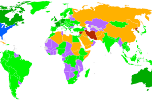
News this week that Microsoft is killing off the Internet Explorer brand and one look at the map above will show you why.
Based on the number of hits as measured by StatCounter in July 2014, it shows which browser is responsible for the largest share of traffic by country. The overwhelming winner is Google’s Chrome browser.
Internet Explorer (IE) on the other hand now only leads in Japan and South Korea.
Firefox, formerly the most popular alternative to IE, now only leads in Germany, Cuba, Iran, Indonesia, Eritrea, Madagascar, Cameroon, Togo and Burkina Faso.
Opera is popular in Africa because it is often found on feature phones. However, as Africans adopt more smart phones I would expect to see the map turn even more green.
Finally, the Android Browser is still found on very low-end smart phones, but is being supplanted by Chrome. The UC Browser is an alternative mobile browser that’s very popular in both India (leading there) and China.
All this got me to thinking about how the traffic on Brilliant Maps breaks down year-to-date:
1. Chrome – 37.93%
2. Safari (in-app) – 35.82%
3. Safari – 7.93% (which means combined it would outrank Chrome!)
4. Firefox – 7.85%
5. Android Browser – 5.71%
6. Internet Explorer – 3.44%
7. Opera – 0.54%
15. UC Browser – 0.02%
At 3.44%, Microsoft’s not killing off IE, it’s already dead.
Since there are so many Apple and iOS fans on this site you may find the following courses from Udemy interesting:
- iOS 8 and Swift – How to Make a “Freaking” iPhone App
- The Complete iOS8 and Swift Course: Learn by Building 15 Real World Apps
- Android Wear App development: Ride the next wave
Have any opinion on the browser wars? Leave them in the comment section below:


Sandeman21 says
Only problem is this data is not accurate.
http://gs.statcounter.com/#browser-ww-monthly-201412-201502-bar
Laura says
Your link covers the period from December 2014-February 2015 and doesn’t include mobile phones. Wikipedia says the original map was uploaded in July 2014. If you look at browser usage on all platforms from May-July 2014 (StatCounter limits time period to 3 months for maps), you’ll basically get the same results as Gogensi. From what I can tell, the only difference is that Gogensi didn’t include South Sudan while StatCounter shows South Sudan (but doesn’t provide any data).
Anyway…I abandoned Internet Explorer a long time ago. I used Firefox for a couple of years but I felt like it got too bloated so I switched to Chrome. Can’t say I’ll miss it!
xxx says
StatCounter seems to suggest only Chrome and Firefox are left, with Japan holding out with IE. The map above seems to be outdated andor wrong, I highly doubt half of Africa is using Opera for some reason?
John Flow says
What kind of figures are those?
Better take a look here –> http://en.wikipedia.org/wiki/Usage_share_of_web_browsers#User_agent_spoofing