
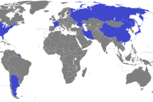
The map above shows the world divided into two regions with approximately equal military expenditures. The area in blue represents countries that are NATO members aka the “West,” who account for 51% of the world’s militarily spending. And the red countries make up the “Rest.”
The data comes from the Stockholm International Peace Research Institute Military Expenditure Database. Here are just a few fact about global military spending:
- Globally, combined military spending stands at $1.7 trillion or 2.3% of global GDP.
- The US is by far the world’s largest military spender, spending $596 billion per year or 3.3% of their GDP on the military.
- Therefore, US military spending is just under 36% of the global total and 69% of NATO’s total.
- The second biggest spender is China at just $215 billion annually or just 1.9% of their GDP.
- Rounding out the top 10 are: Saudi Arabia (13.7% of GDP), Russia (5.4% of GDP), UK (2.0% of GDP), India (2.3% of GDP), France (2.1% of GDP), Japan (1.0% of GDP), Germany (1.2% of GDP) and South Korea (2.6% of GDP).
To learn more about military spending in the US and globally have a look at the following books:
- NATO 1948: The Birth of the Transatlantic Alliance
- The American Warfare State: The Domestic Politics of Military Spending
- America’s War Machine: Vested Interests, Endless Conflicts
Think this map is interesting? Please help us by sharing it:

Alex Munger says
And yet the Western Bloc continually accuses Russia (or whomever is in its cross-hairs at the time) of “provocation” and “aggression”. Thanks for this, a stark visual reminder of the rift in world geopolitics.
Geoff Clarke says
There are of course many other ways to divide countries into two equal expenditure areas, depending what you want to show. I am sure that starting with Russia and China would create a different map than one starting with America. For imparital clarity you should really show some other versions.