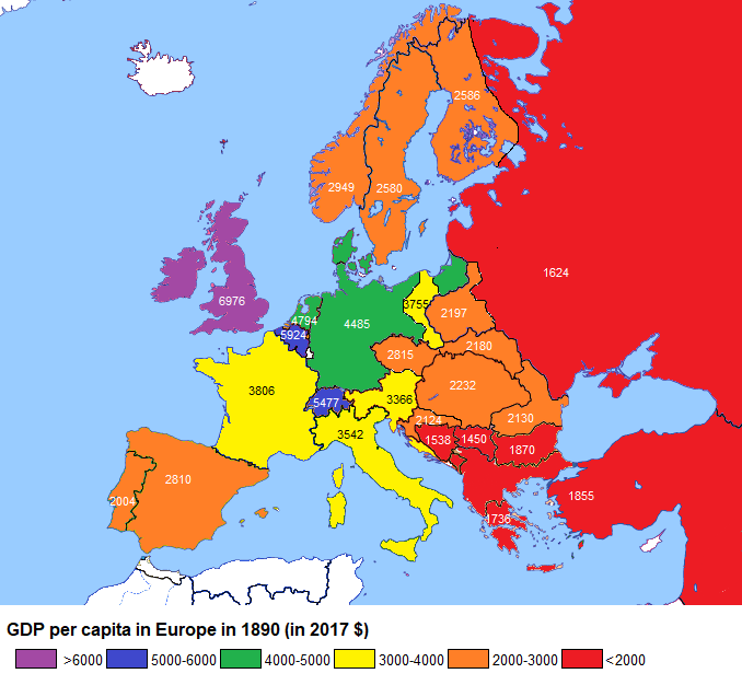
The map above shows the very approximate GDP per capita for various European states in 1890. Below we look at how these have changed over the past 127 years.
Making Sense Of The World, One Map At A Time
The map above shows the very approximate GDP per capita for various European states in 1890. Below we look at how these have changed over the past 127 years.
The map above, which shows GDP per capita for European countries in 1990 (just as the Iron Curtain was falling), reveals a general increase as one travels from east to west and from south to north. It also invites the question of what may have changed in the intervening quarter century.
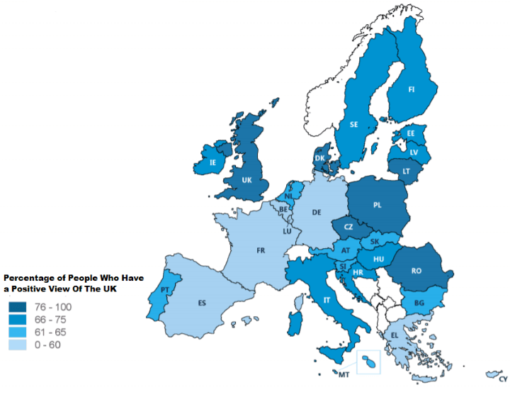
The map above shows the percentage of EU citizens in each member country who have a positive view or image of the United Kingdom.
The survey data was taken in September and October 2017, so should take into account any feelings about Brexit.
The map above shows Europe’s capital cities by coats of arms or emblems.
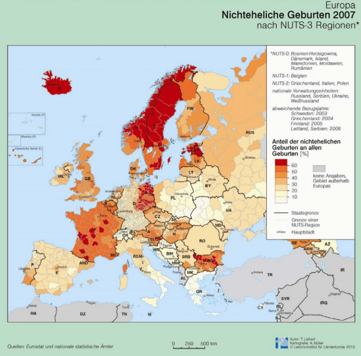
The map shows the percentage of children in various European countries born to parents who are not married.
While the map is in German, the colours are fairly obvious, the darker the red the greater the share of children born outside of marriage is.
As the title suggests, the map above shows what Europe would look like if the Mediterranean suddenly switched places with Scandinavia.
The maps above show how Europeans feel about their children being in relationships with people from different racial/religious minorities. (Black, Asian, Muslim and Jewish).
The data comes from the 2015 Eurobarometer report on Discrimination in the EU.
You can see each map in more detail below:
The map above shows which surnames (last names) are most popular in each Italian region. Although, even these surnames only account for around 1% of all Italian surnames due to the huge diversity that exists.
Reddit user medhelan also points out a few other interesting things:
The map above gives a very general overview of the legal status of Jews in various major European countries around the year 1500.
Interestingly, the two European countries with the largest Jewish populations today (France: 465,000; UK: 270,000) both had Jewish bans in 1500.
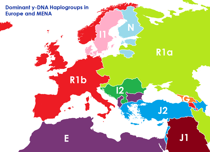
The map above shows what the borders of Europe, the Middle East and North Africa might look like if they were based on the dominant Y-DNA haplogroup rather than ethnicity and/or any other political considerations.